scroll
 slide
slide
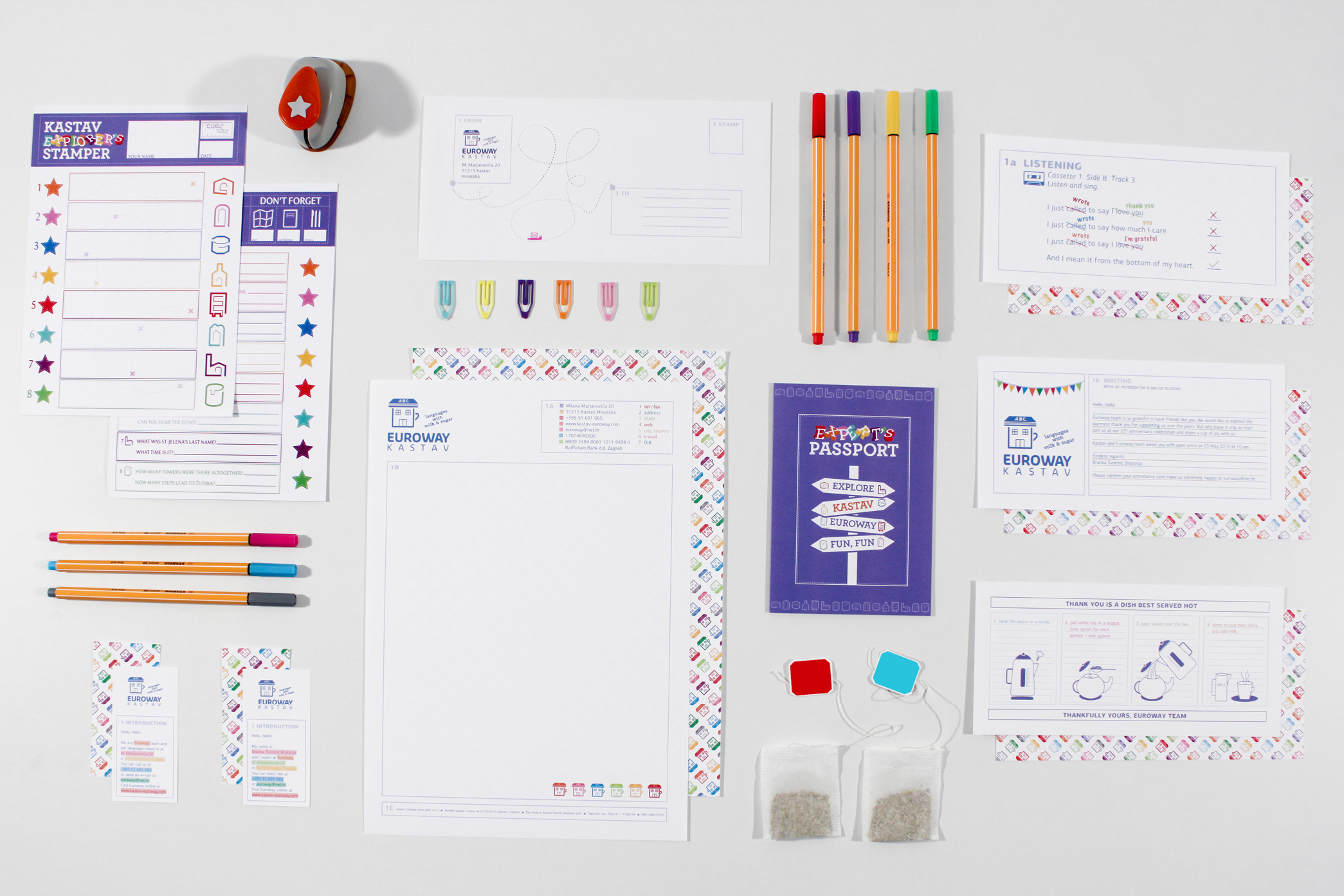
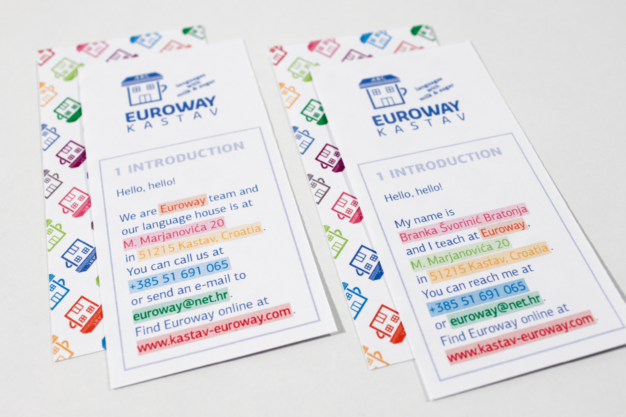
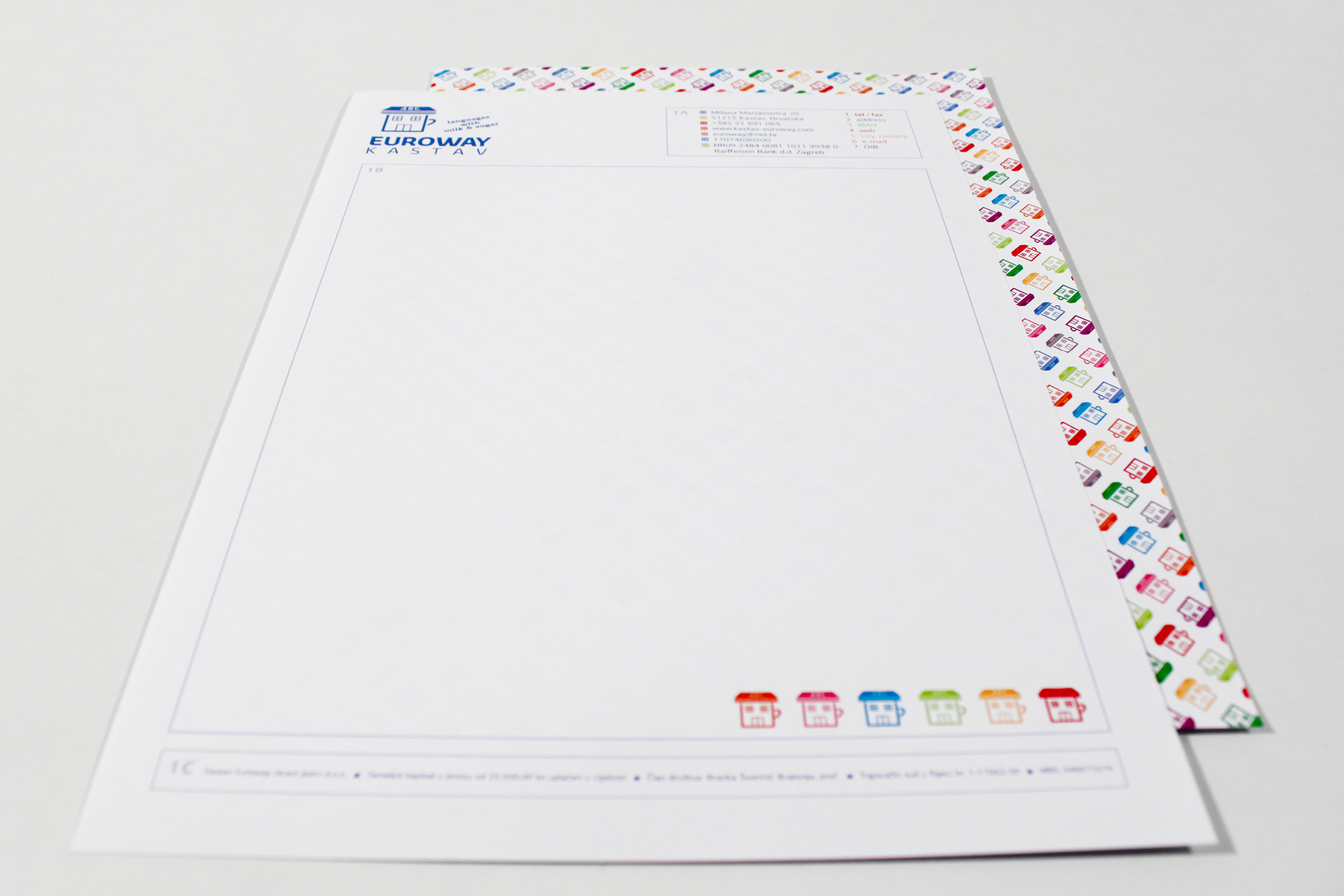
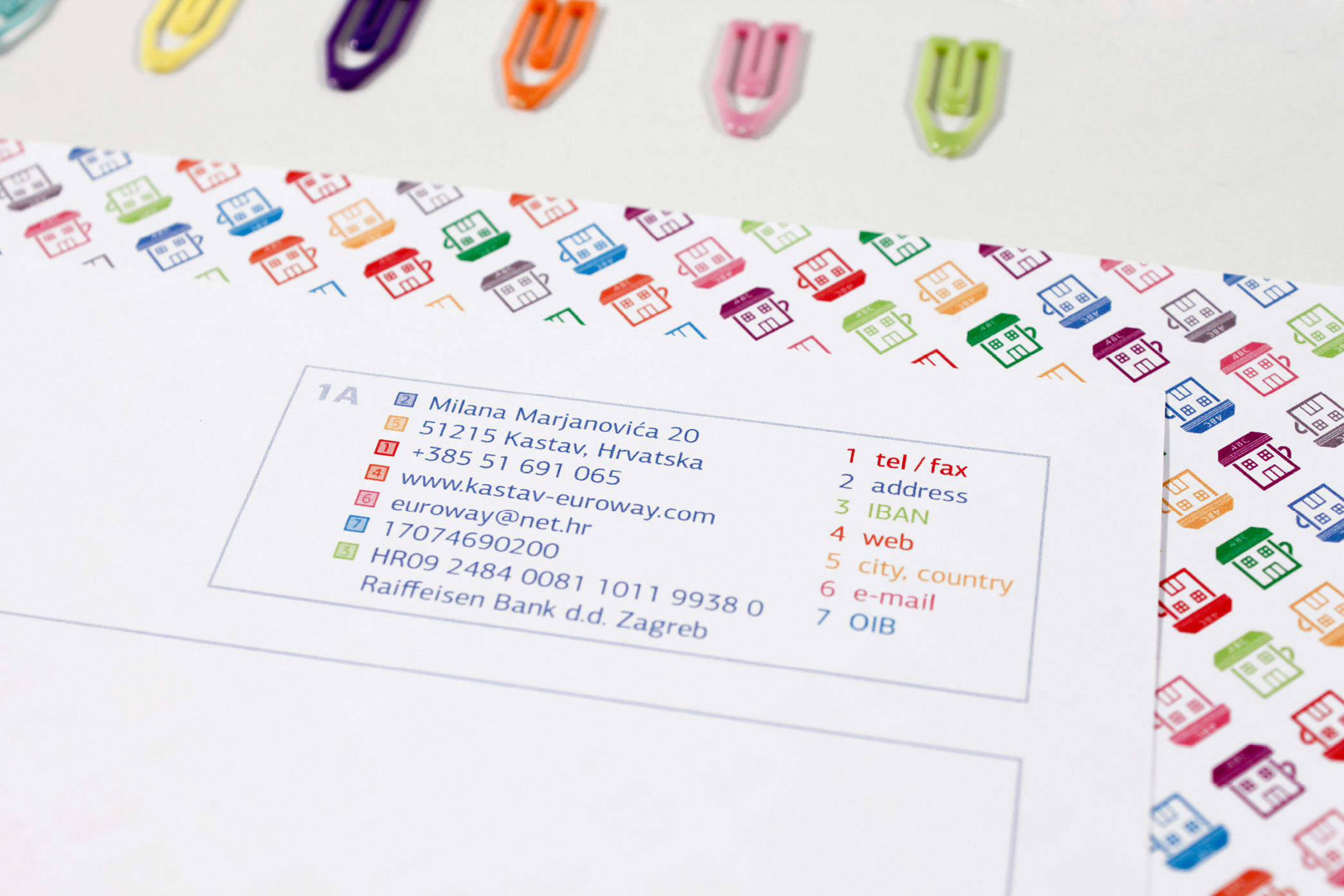
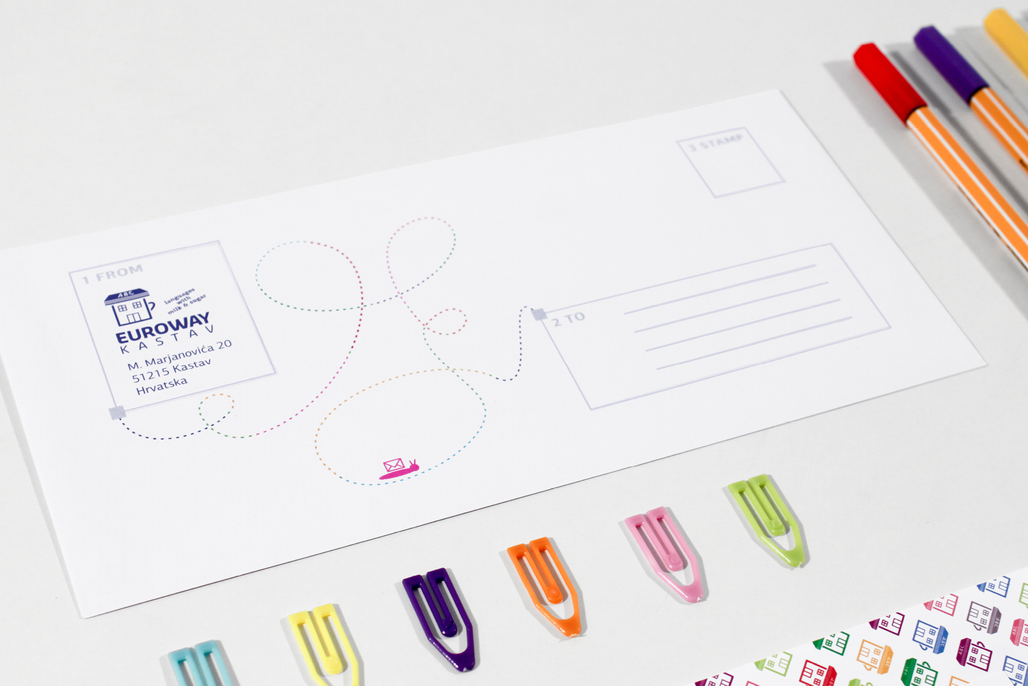
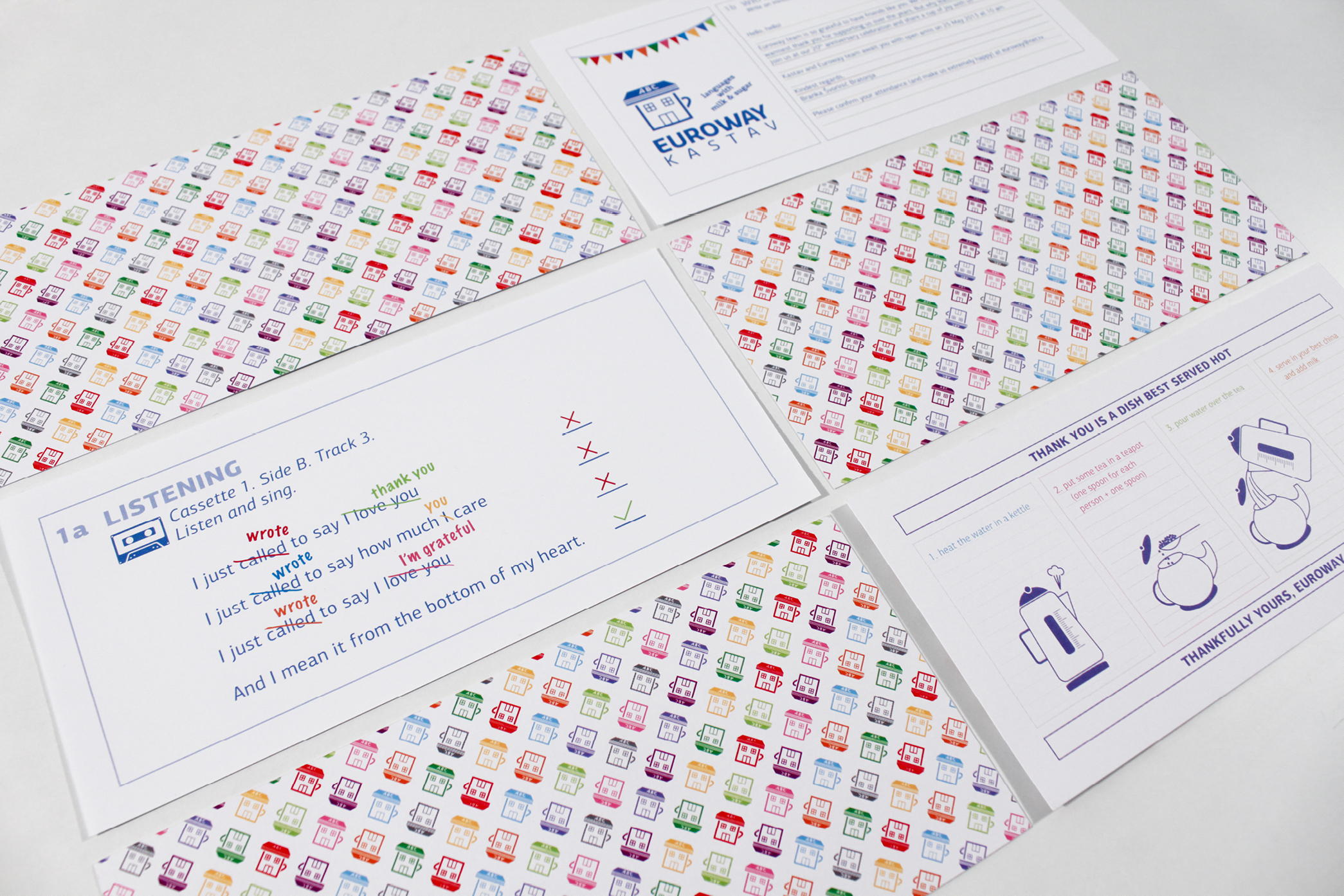
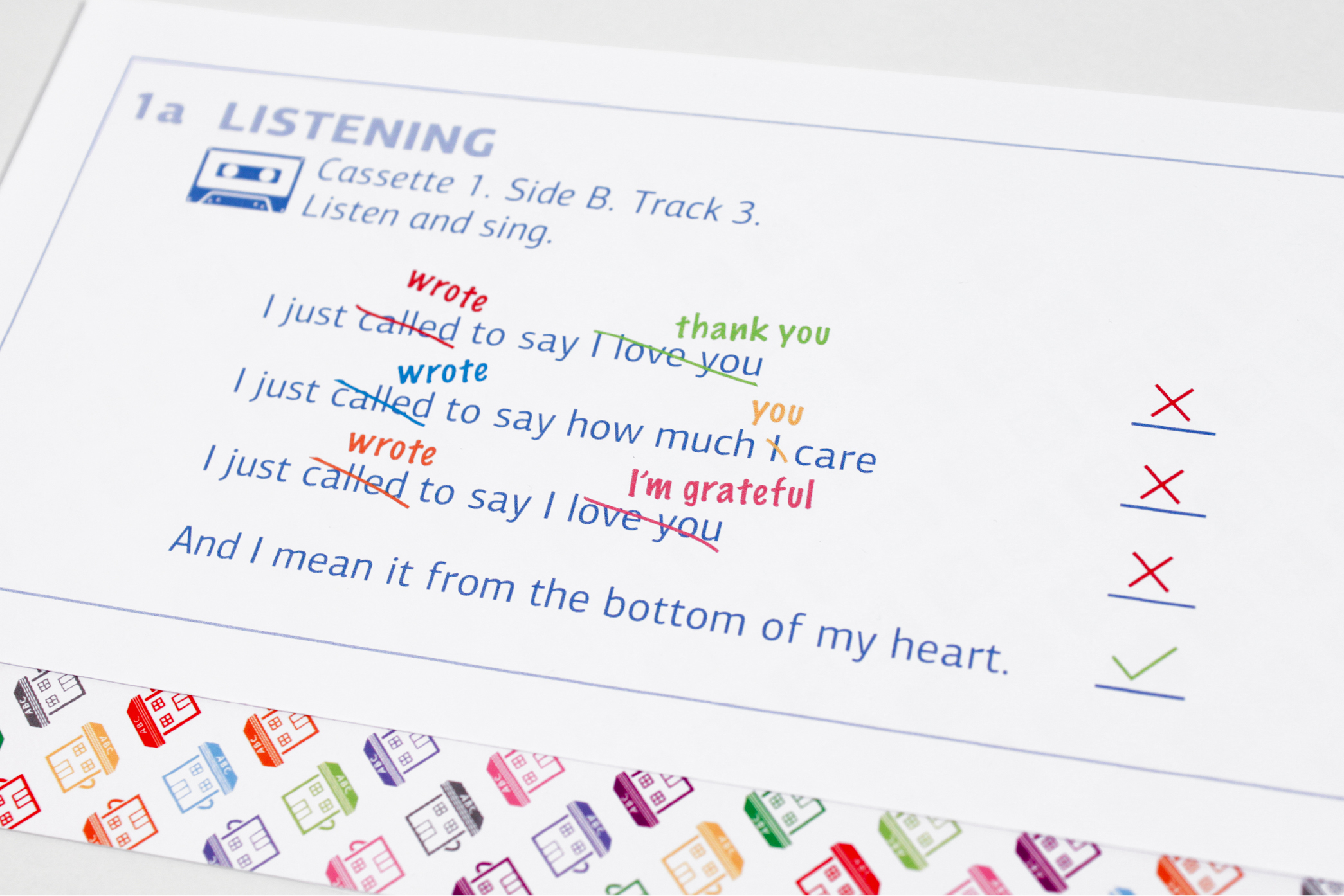
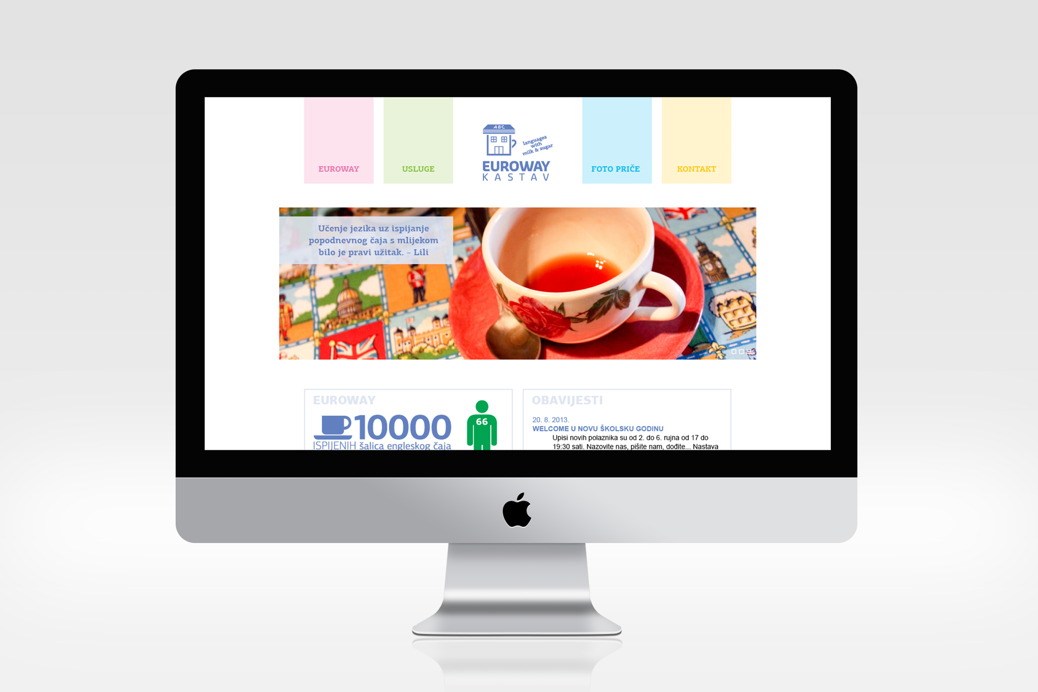
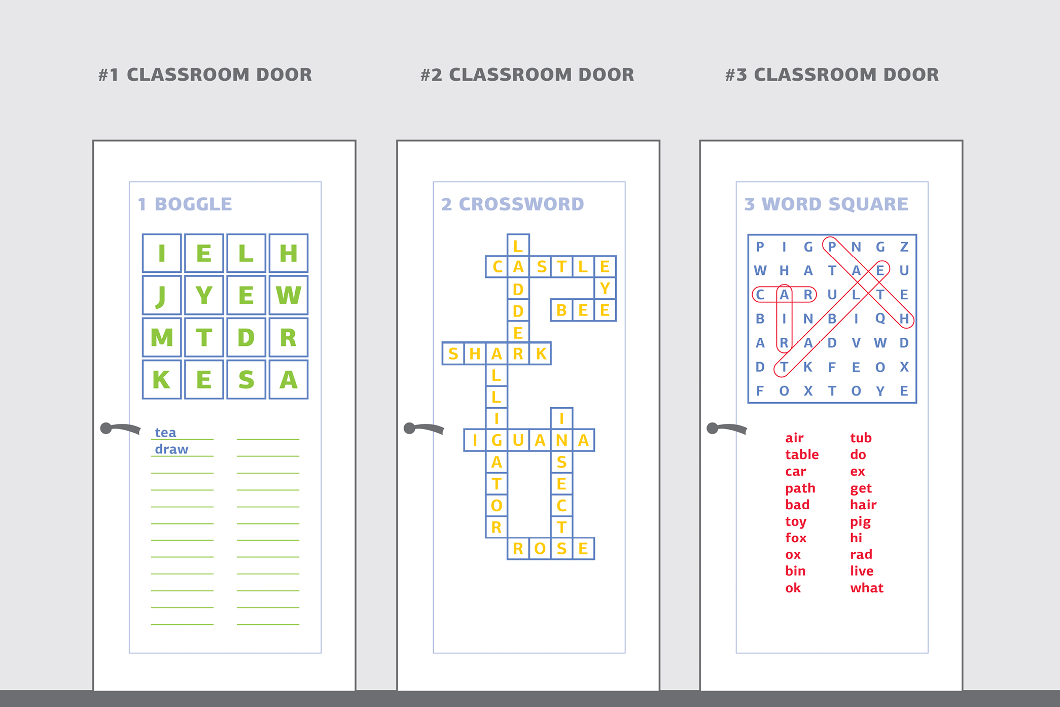
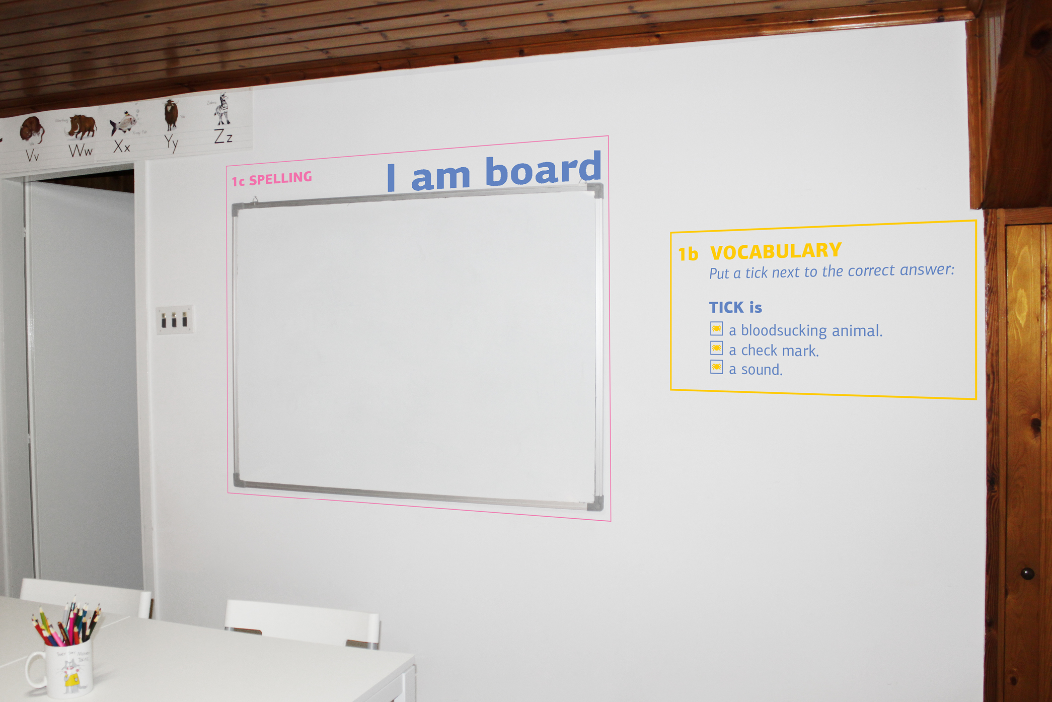
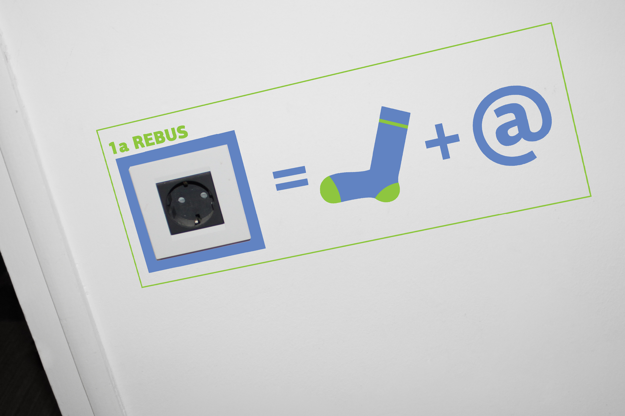
A small language school from the small town of Kastav approached us with a great wish for visual identity redesign. Line by line, color by color, redesign soon became a completely new design which reflected warmth and Euroway’s unique family atmosphere much better than the previous design. Since the school spices up the classes with various customs and interesting rituals such as drinking afternoon tea or Easter egg hunts, the identity was based on the motto “languages with milk & sugar”. Each lesson is equally sweet and the language is learned at every step. Literally. So every material designed for Euroway is a little language exercise - from letterhead and business cards to wall prints.
Categories: visual identity, copywriting, digital content, print, books and publications