 visual
 text
text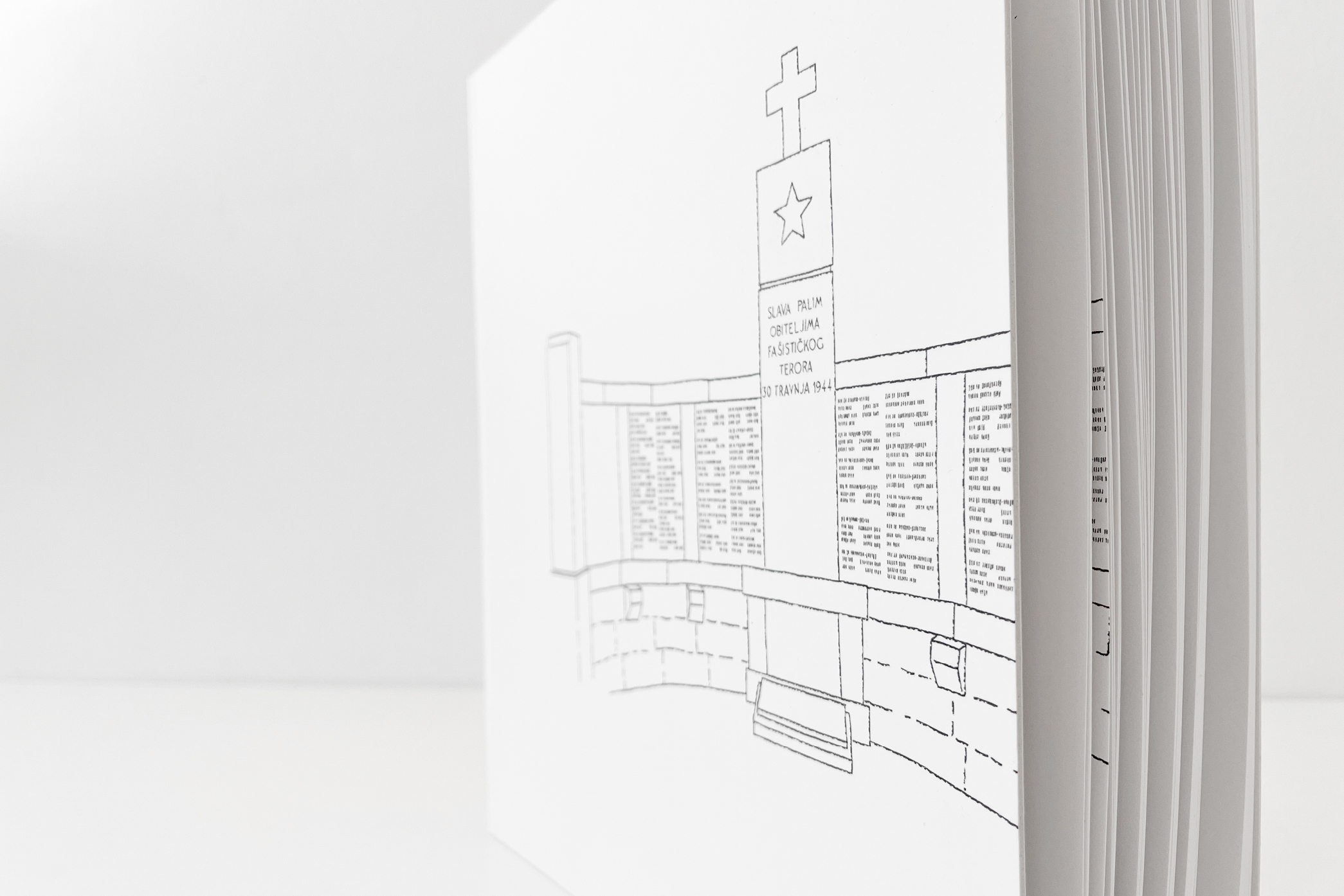
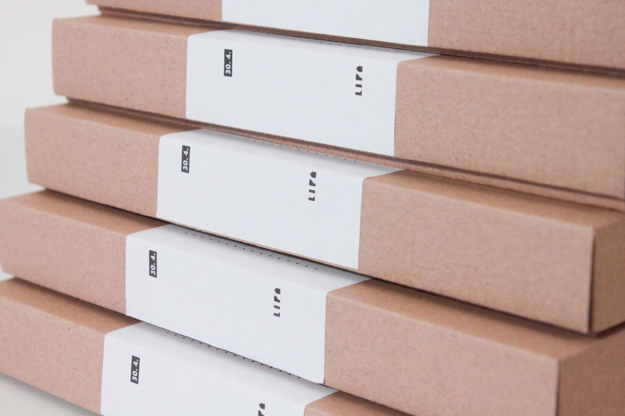
LIPA REMEMBERS - REVISION OF THE LIST OF VICTIMS
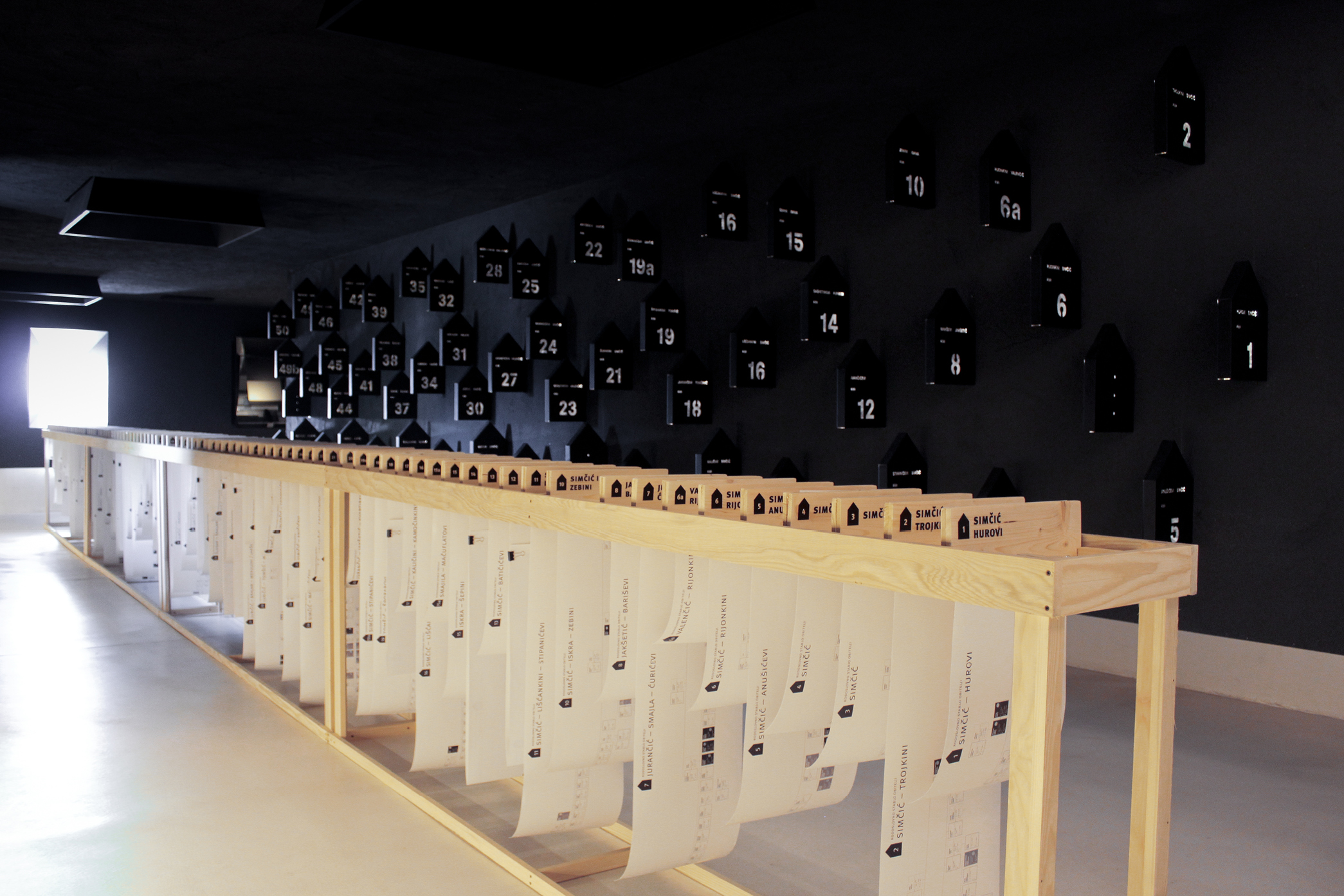
After designing Lipa family trees for genealogy exhibition at Memorial Centre Lipa Remembers, this time we needed to adapt the design for the new publication Revision of the list of victims from Lipa killed on 30 April 1944. The size of the book corresponds to the importance of the new findings about the victims: when open, the book measures 60 cm in width. Monumental indeed. Except family trees, the central part of the publication is the table with inform...
Leaf through the project…