scroll
 slide
slide
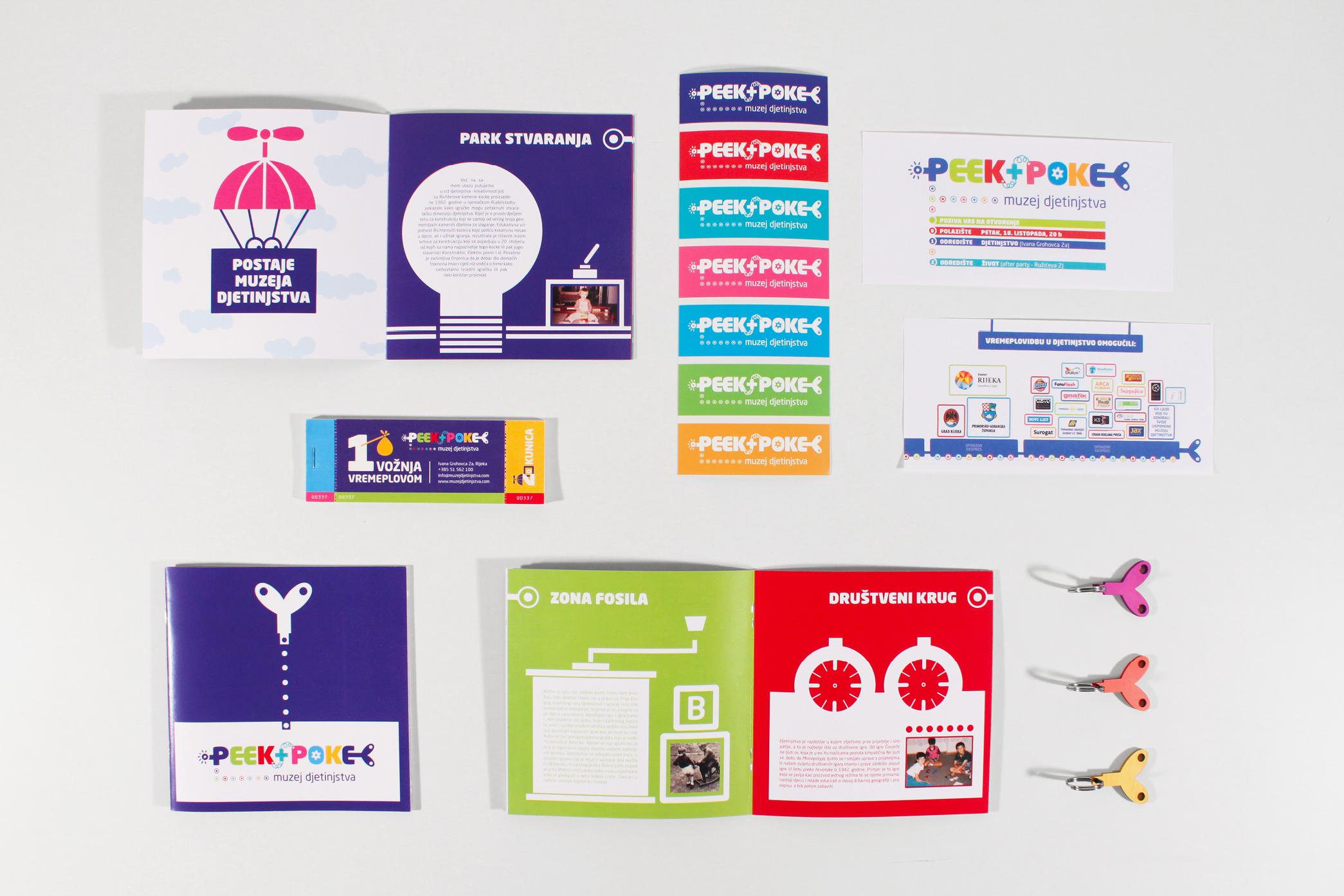
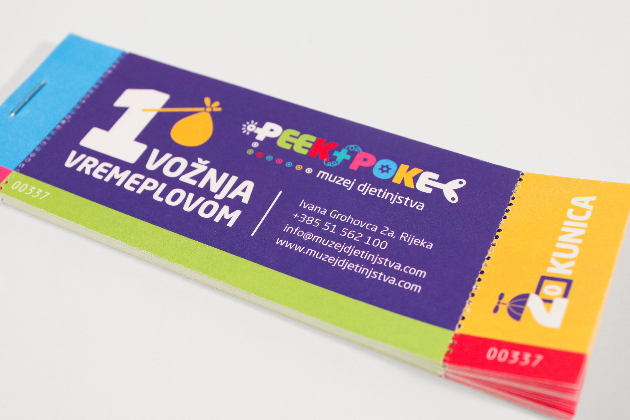
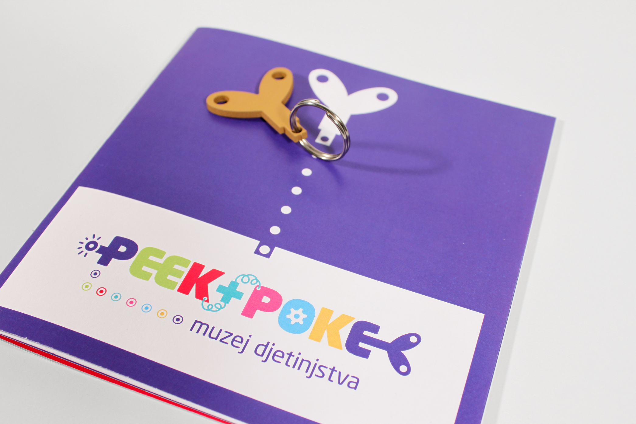
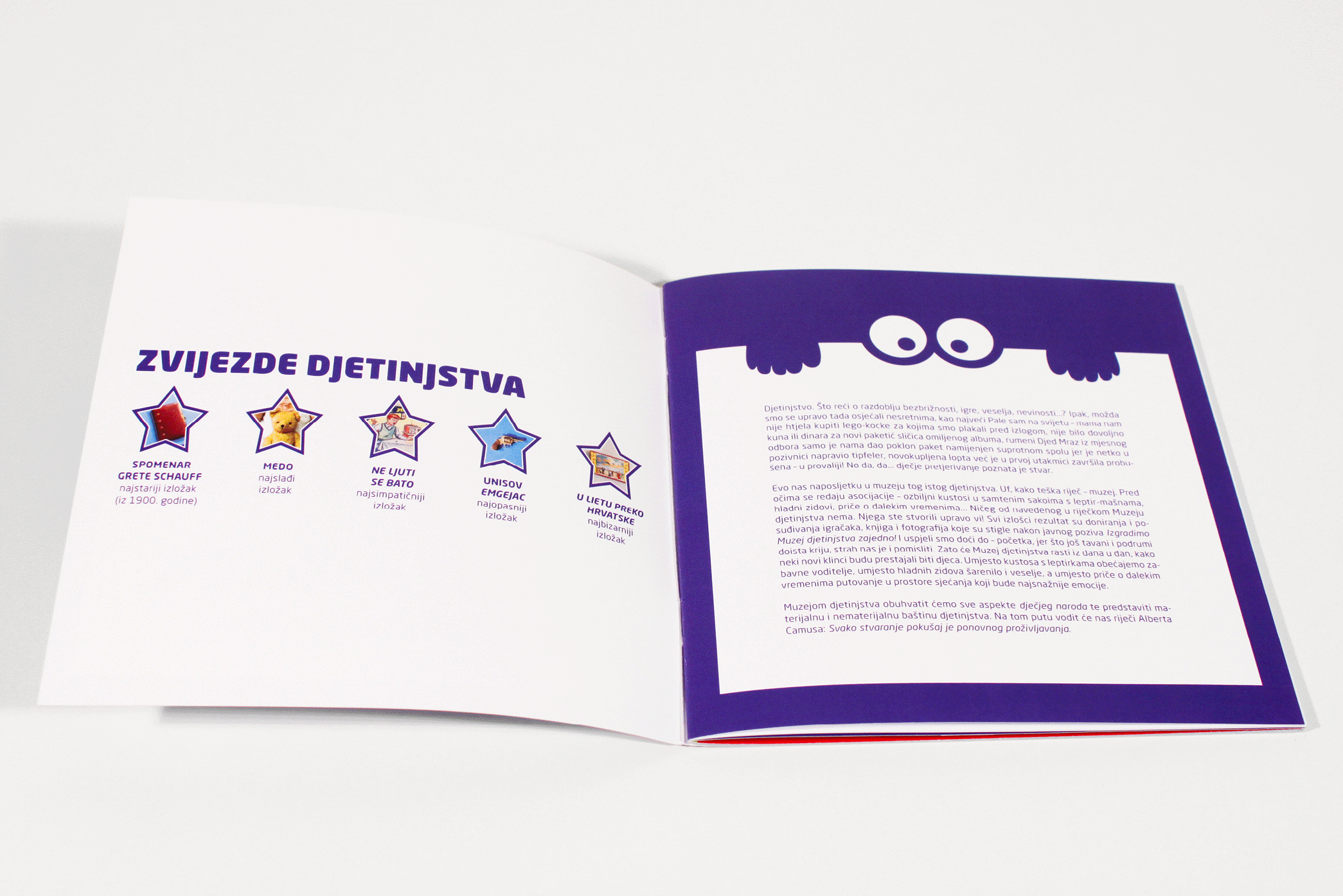
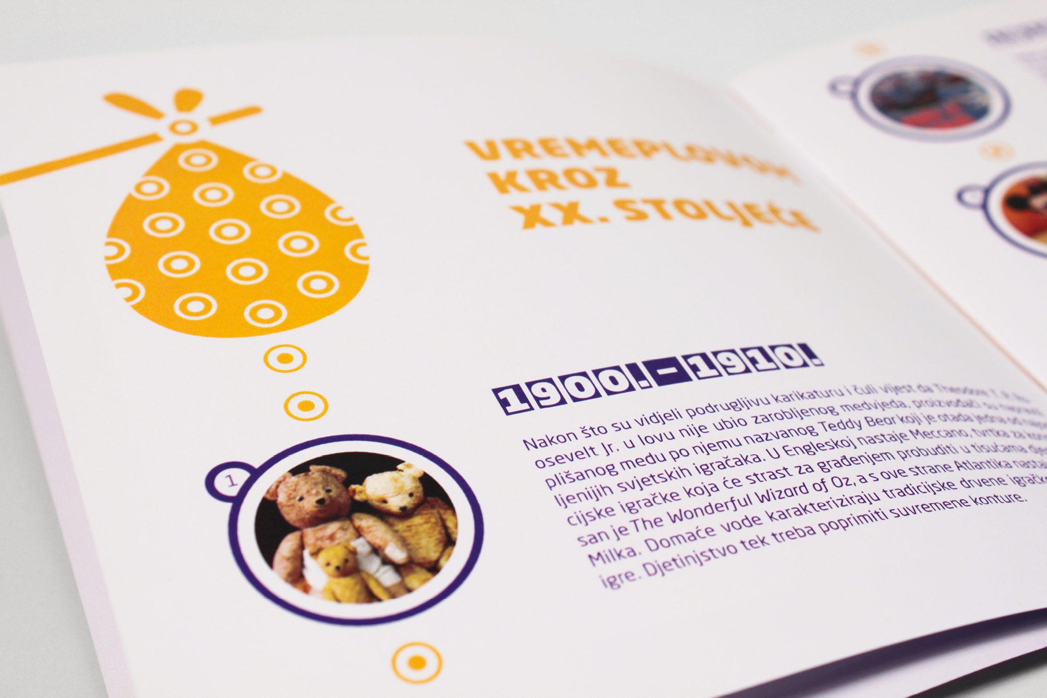
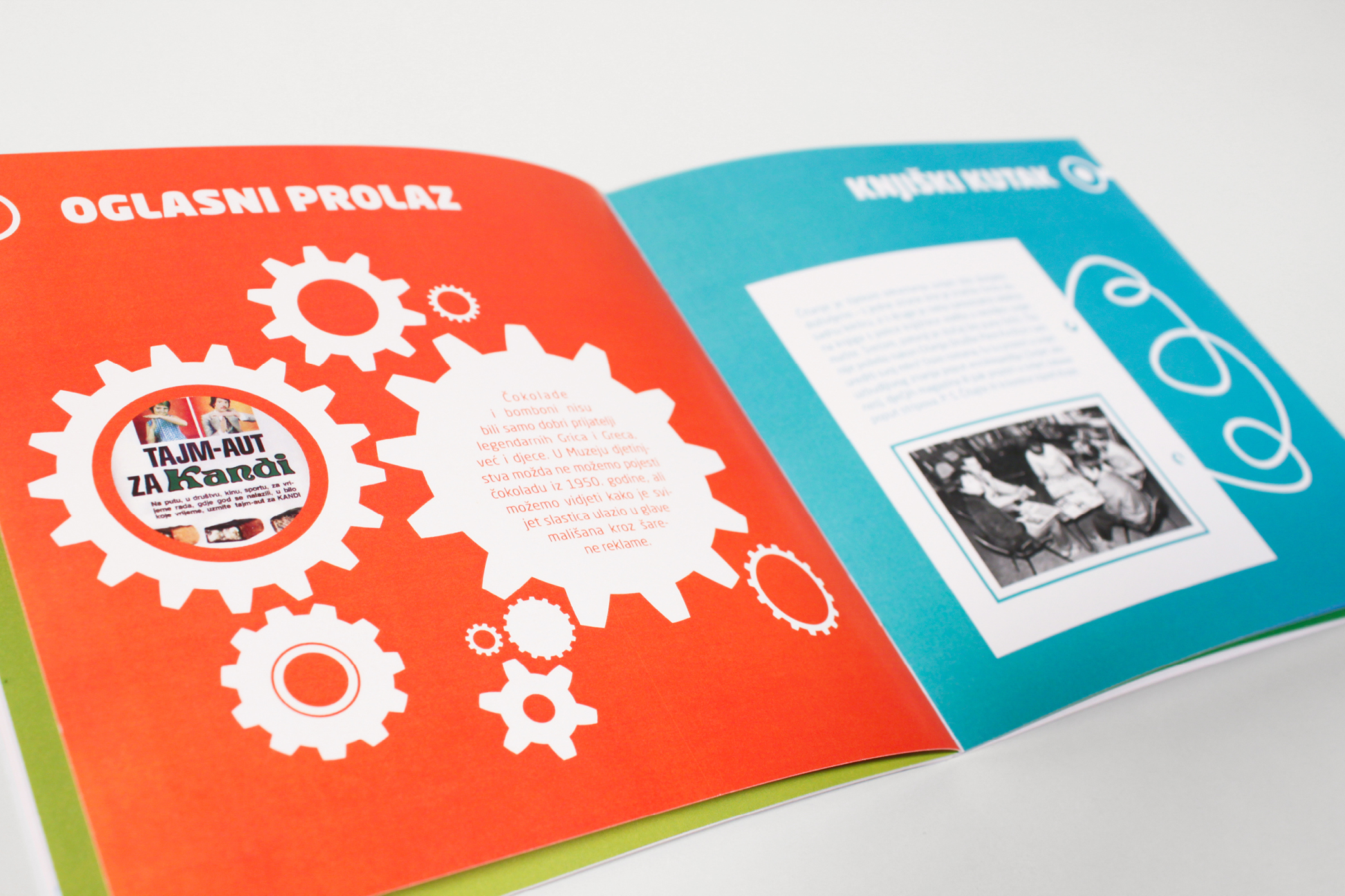
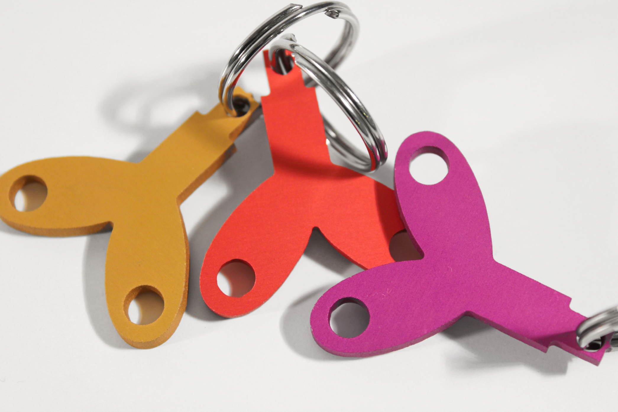
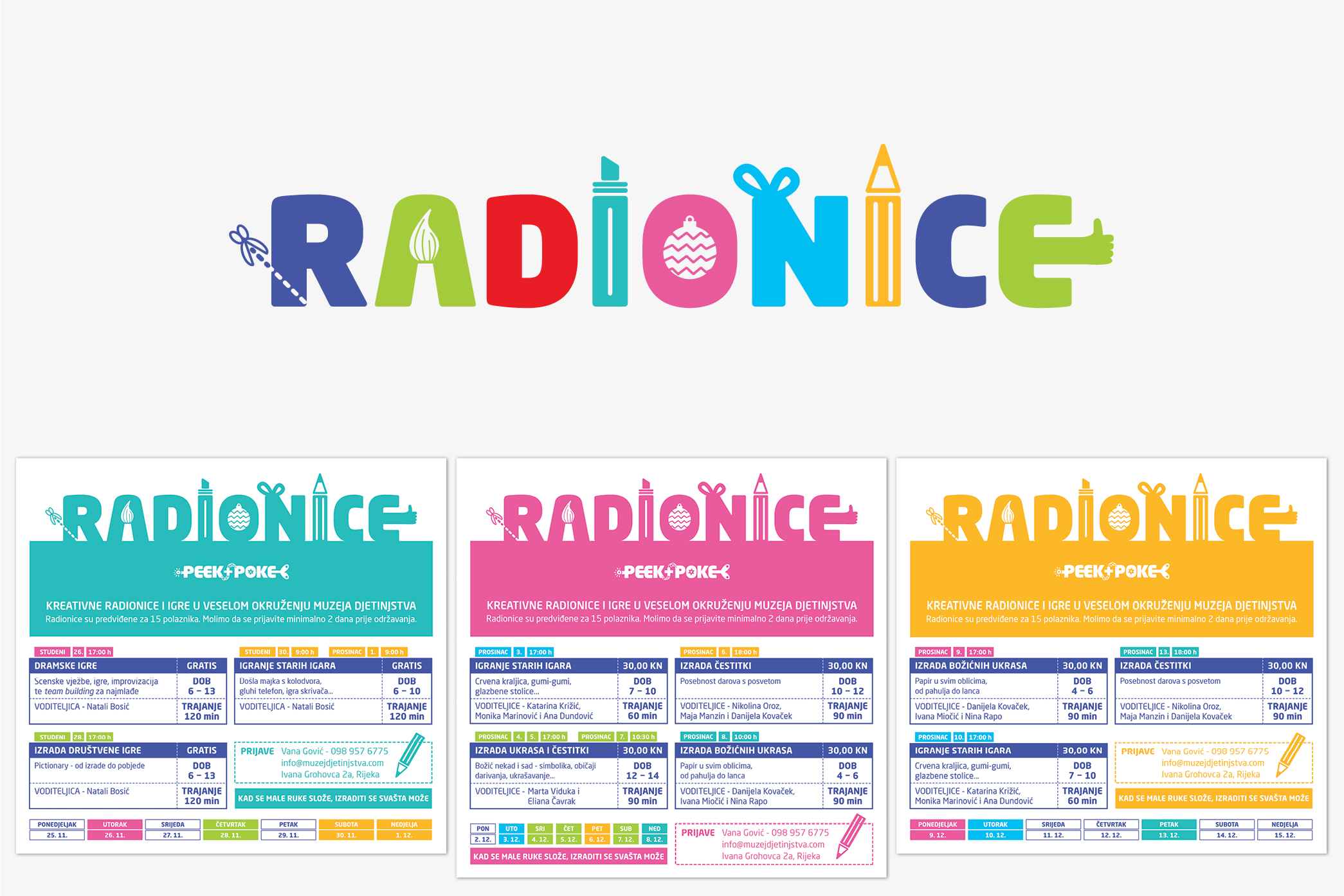
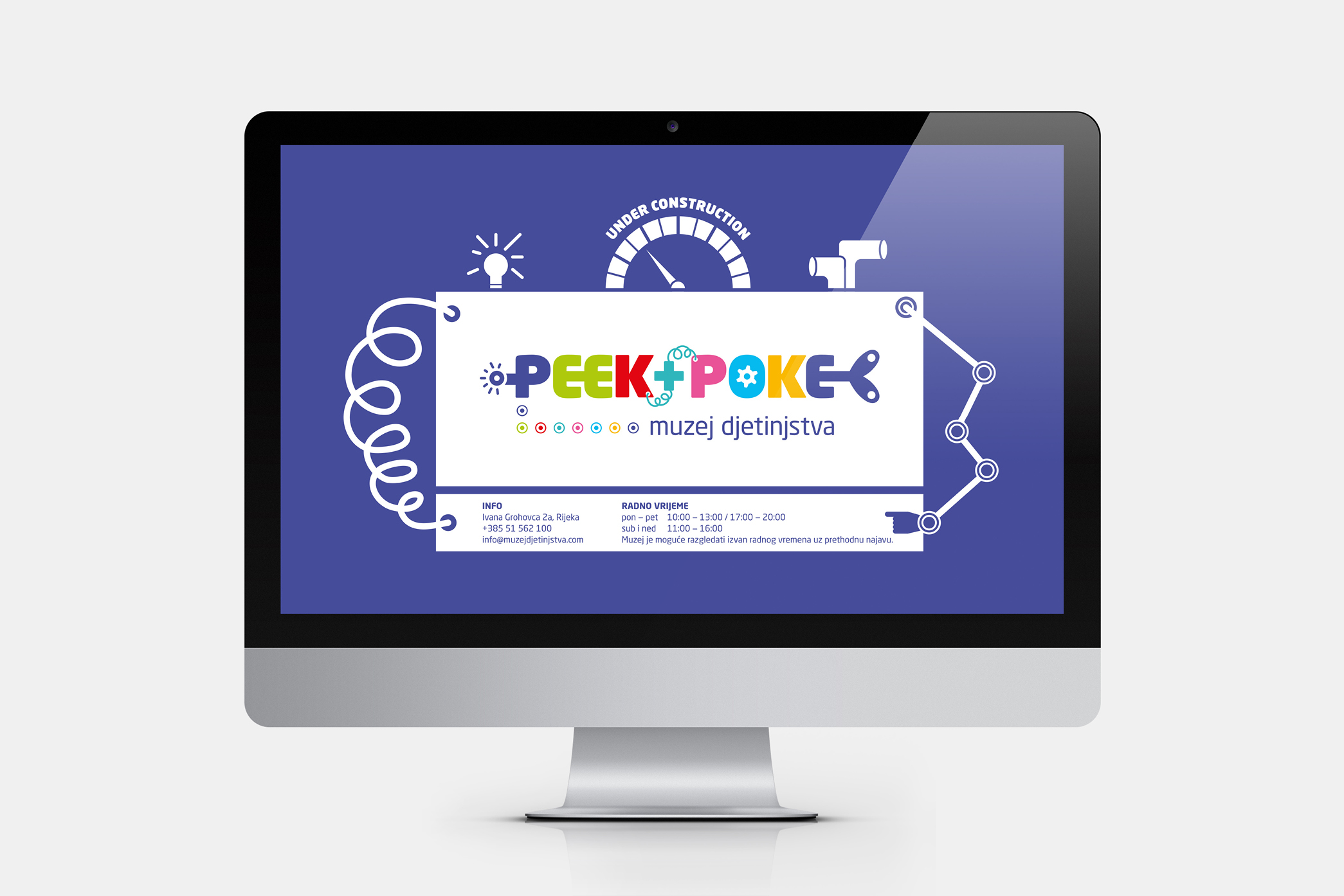
Designing for the museum of childhood sounds like a dream project. And it was. While we were admiring toys and games of our past, we felt like riding a time machine. So it was only natural to choose the time machine as the concept of the Peek+Poke’s visual identity. That’s why the name of the museum became a colorful time traveling machine and its winding key a recognizable symbol that can be used on its own. Museum’s physical space is divided into sections - time machine’s stops - and the same idea is carried on in the publication as well. We wish you a pleasant journey through the childhood.
Categories: visual identity, copywriting, books and publications, print, digital content