Mediterra
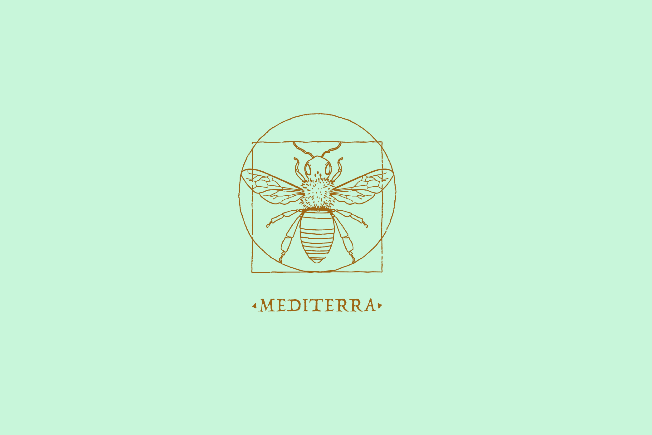
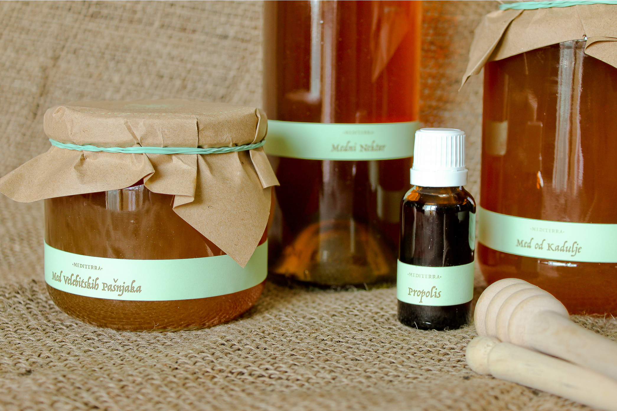
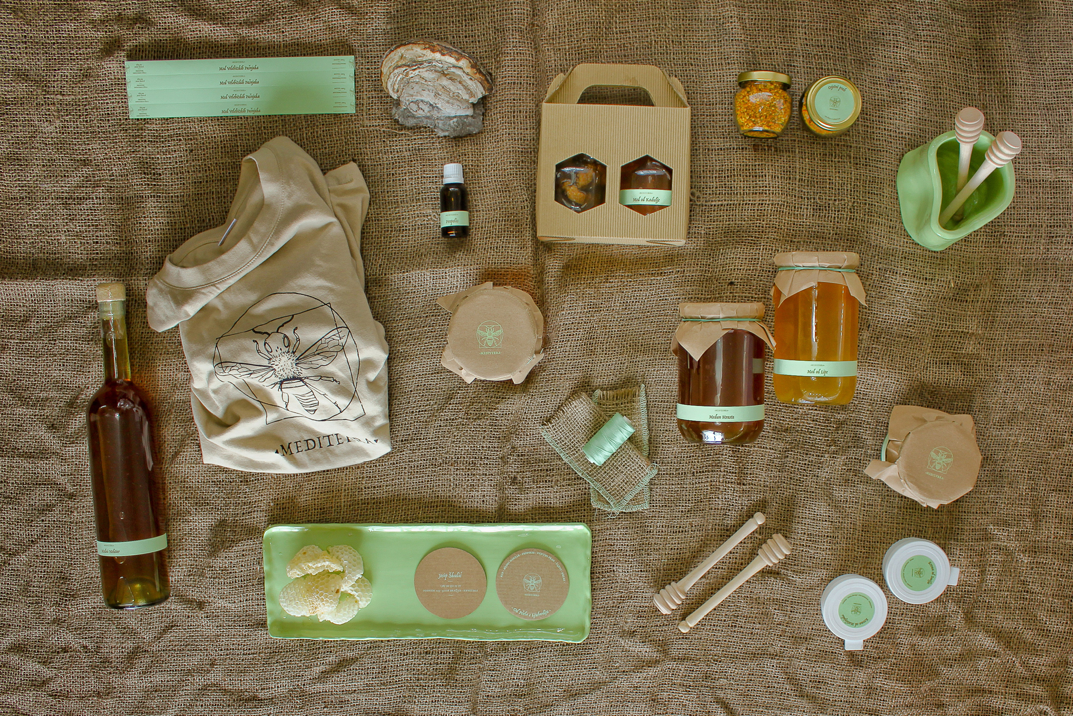
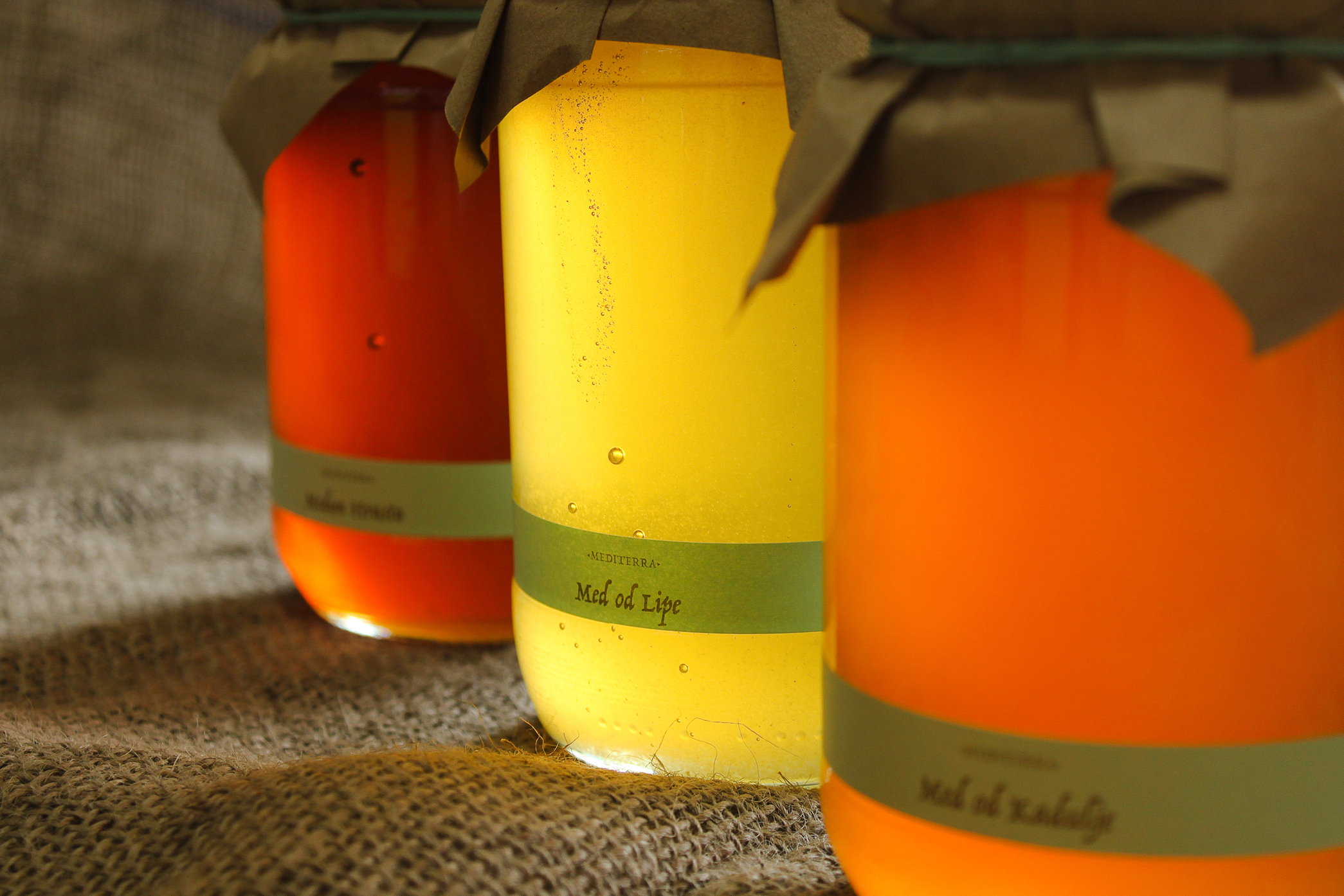
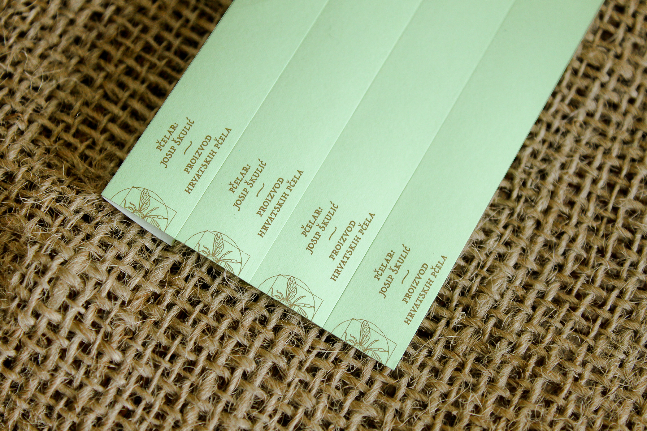
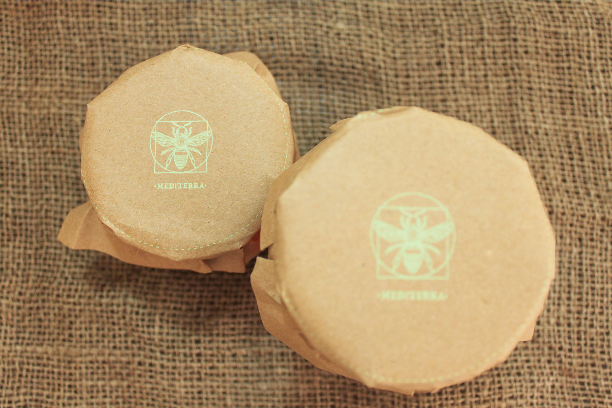
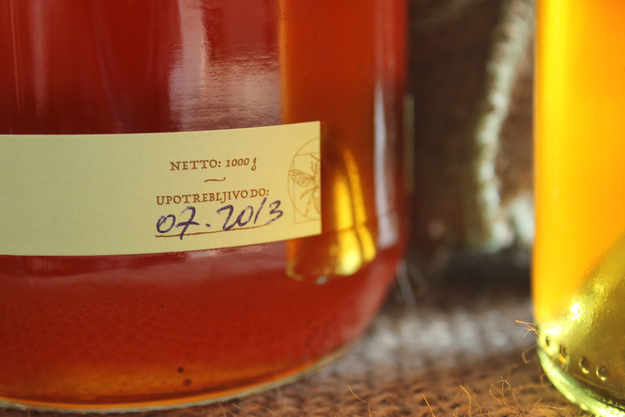
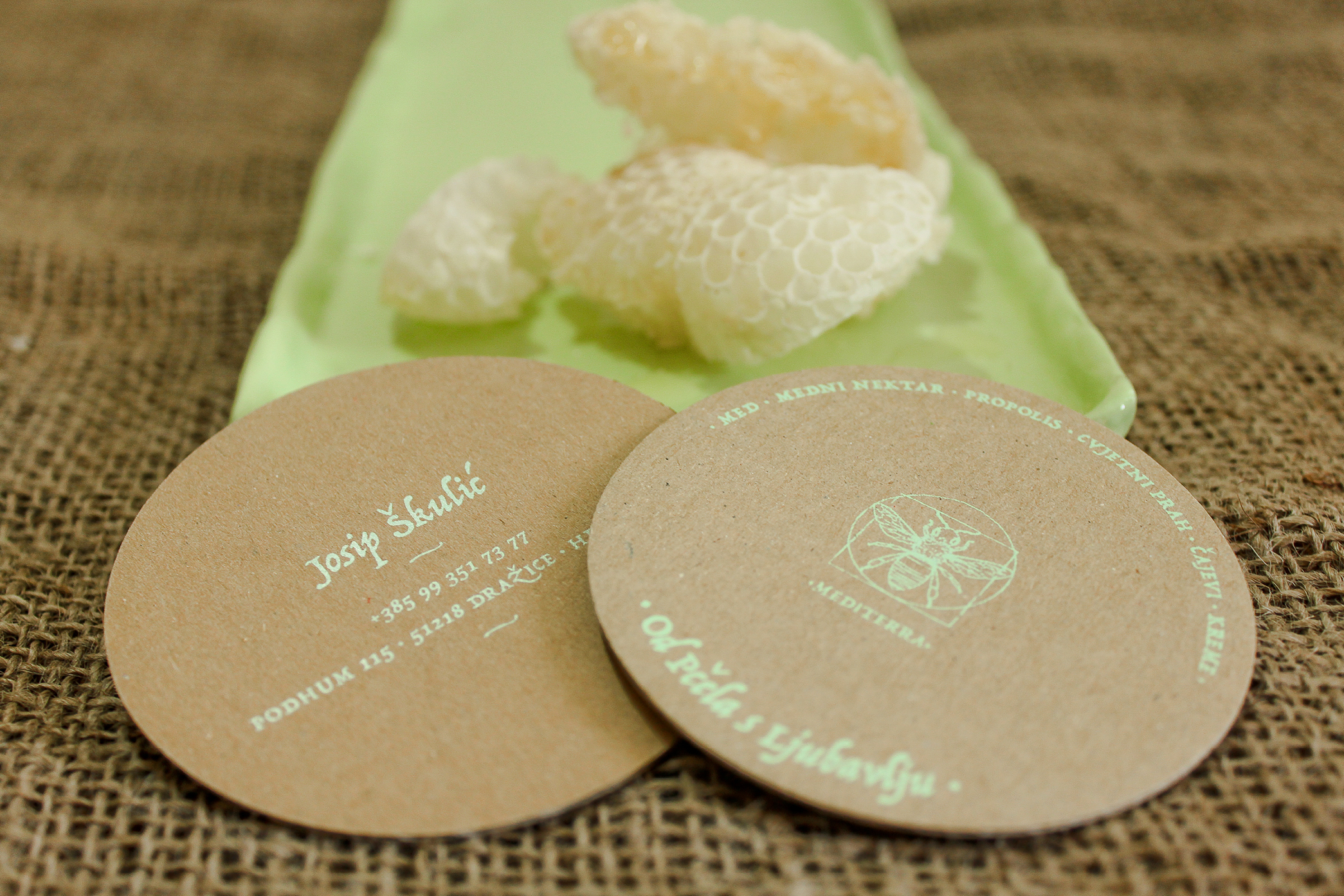
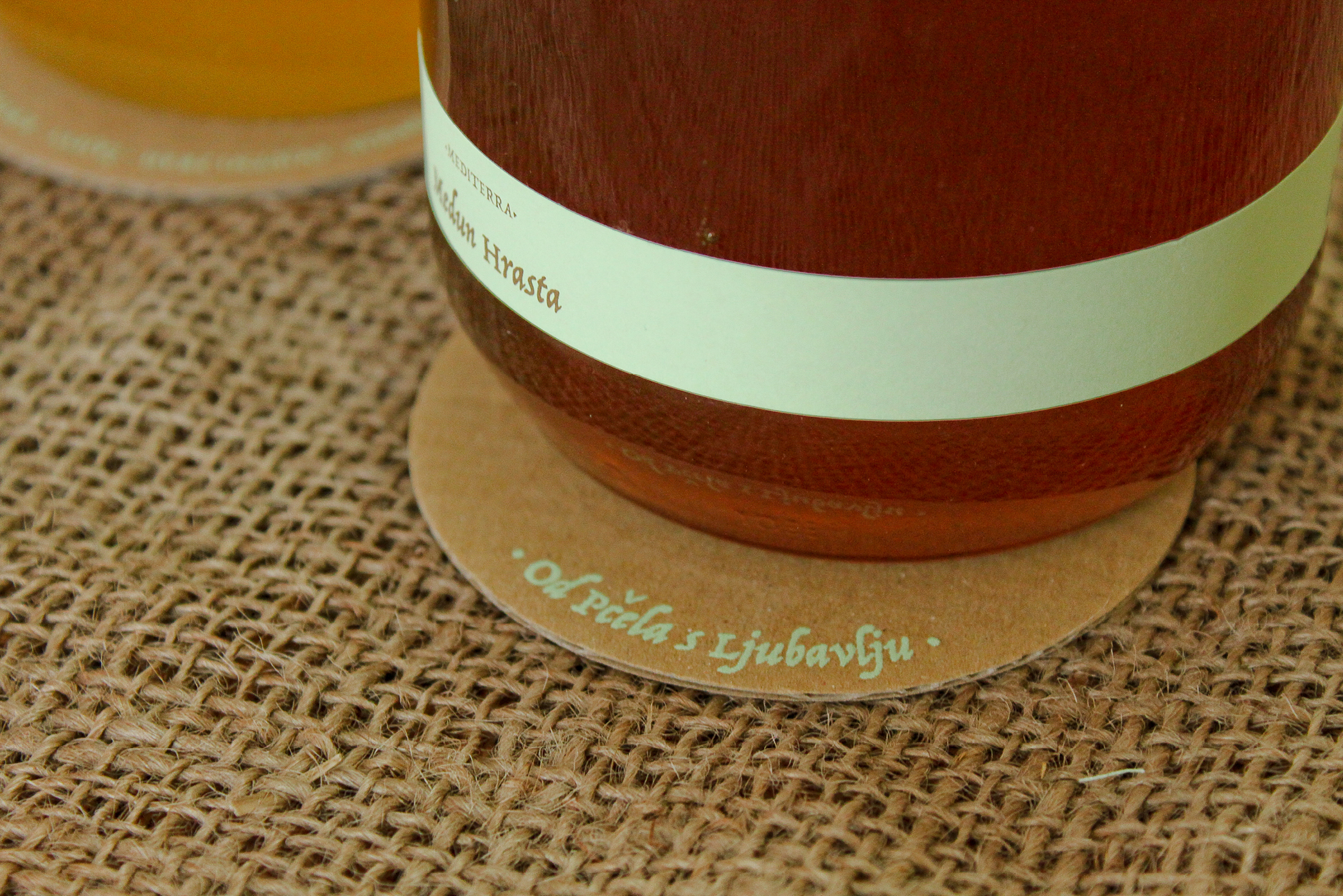
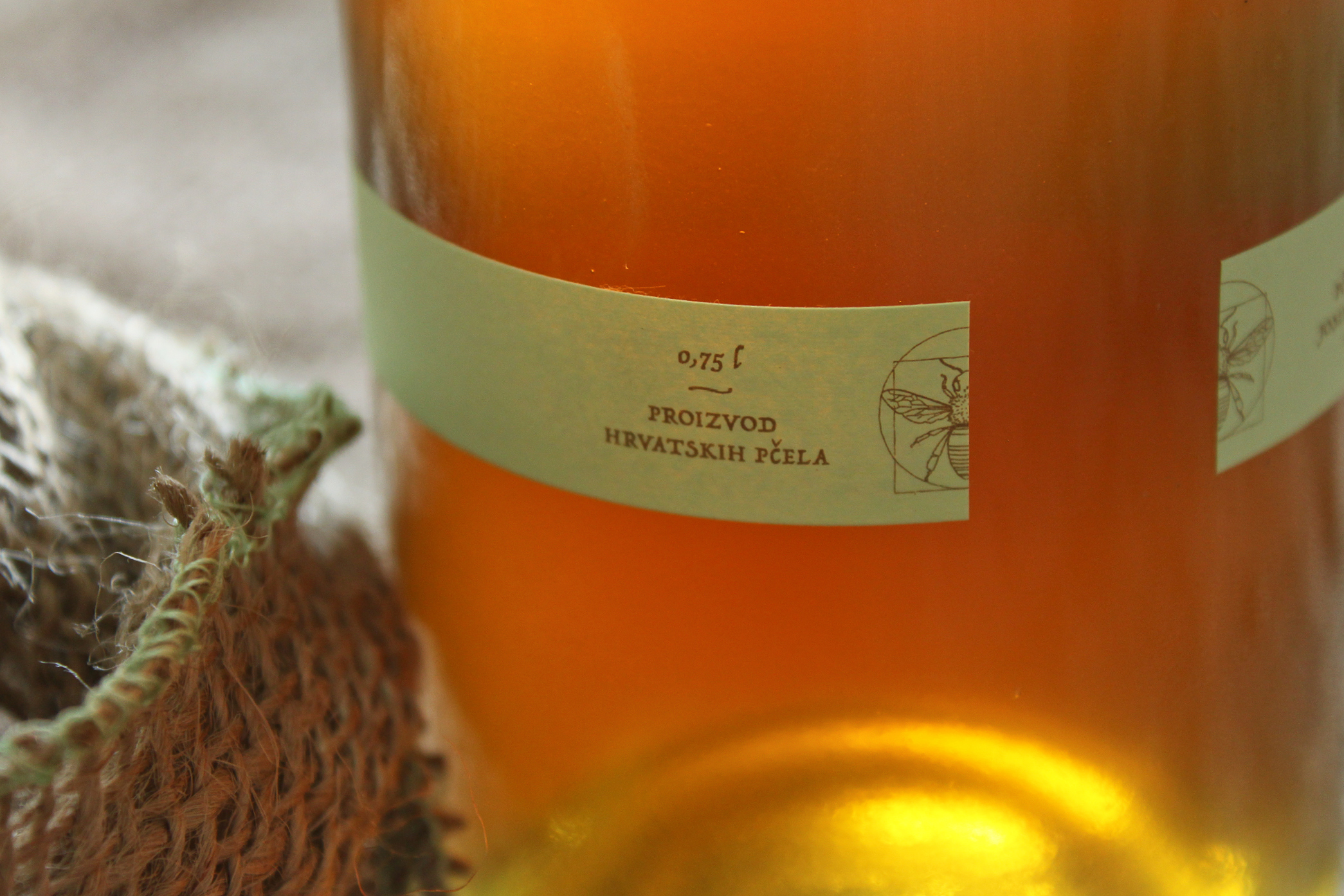
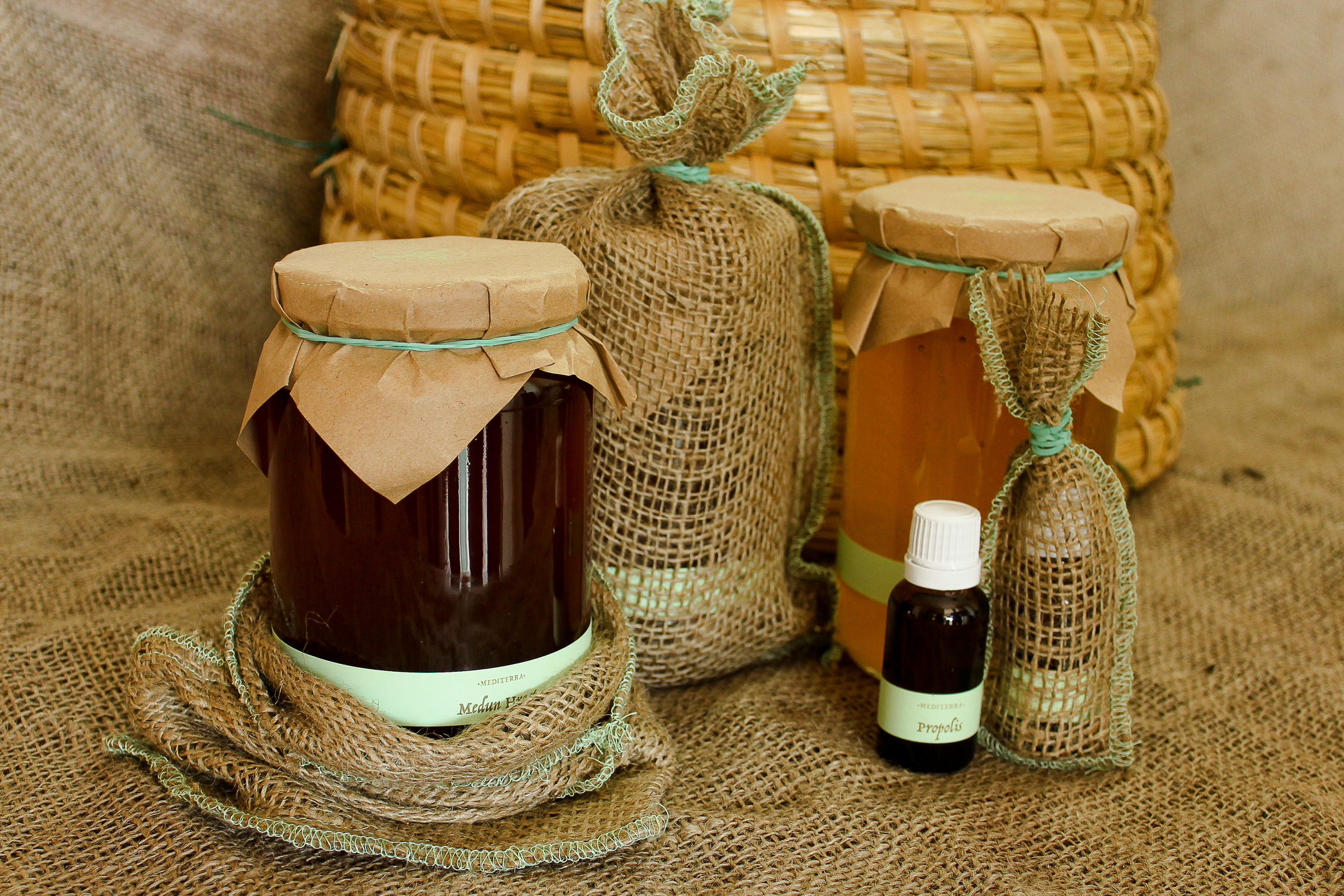
Mmmmm, honey! We all love to have our trusty homemade products dealer, and when you get the chance to create the name and visual identity for that favorite product, it’s a sweet sweet project. Name “Mediterra” combines Croatian word for honey (med) and Latin word for land (terra), and refers to the geographical origin of the honey: Mediterranean. Since all Mediterra’s products revolve around bees, we put the bee in the center and created a sort of “Vitruvian bee” logotype. Considering the quality and popularity of Mediterra’s products, we wanted to keep the labels simple. We left enough space for the color and texture of the product to tell its own story. A very unobtrusive label near the bottom of the jar/bottle offers only basic information about the product, just like stickers on homemade products once did. A special detail in the packaging is the coaster tucked away under the lid and meant to be put under the jar to prevent it from sticking to the shelf. The coaster doubles as a business card with all the information needed for your next order when the last jar is half empty.
Categories: visual identity, naming, packaging and labels, copywriting, print

 scroll
 slide
slide