scroll
 slide
slide
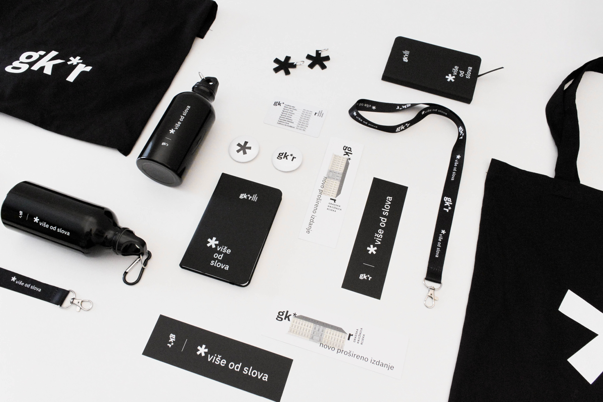
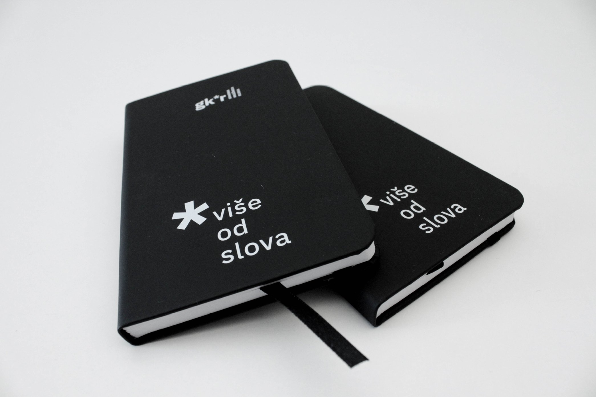
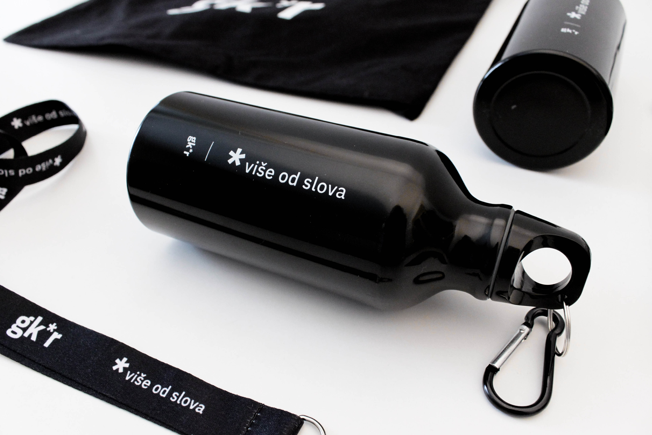
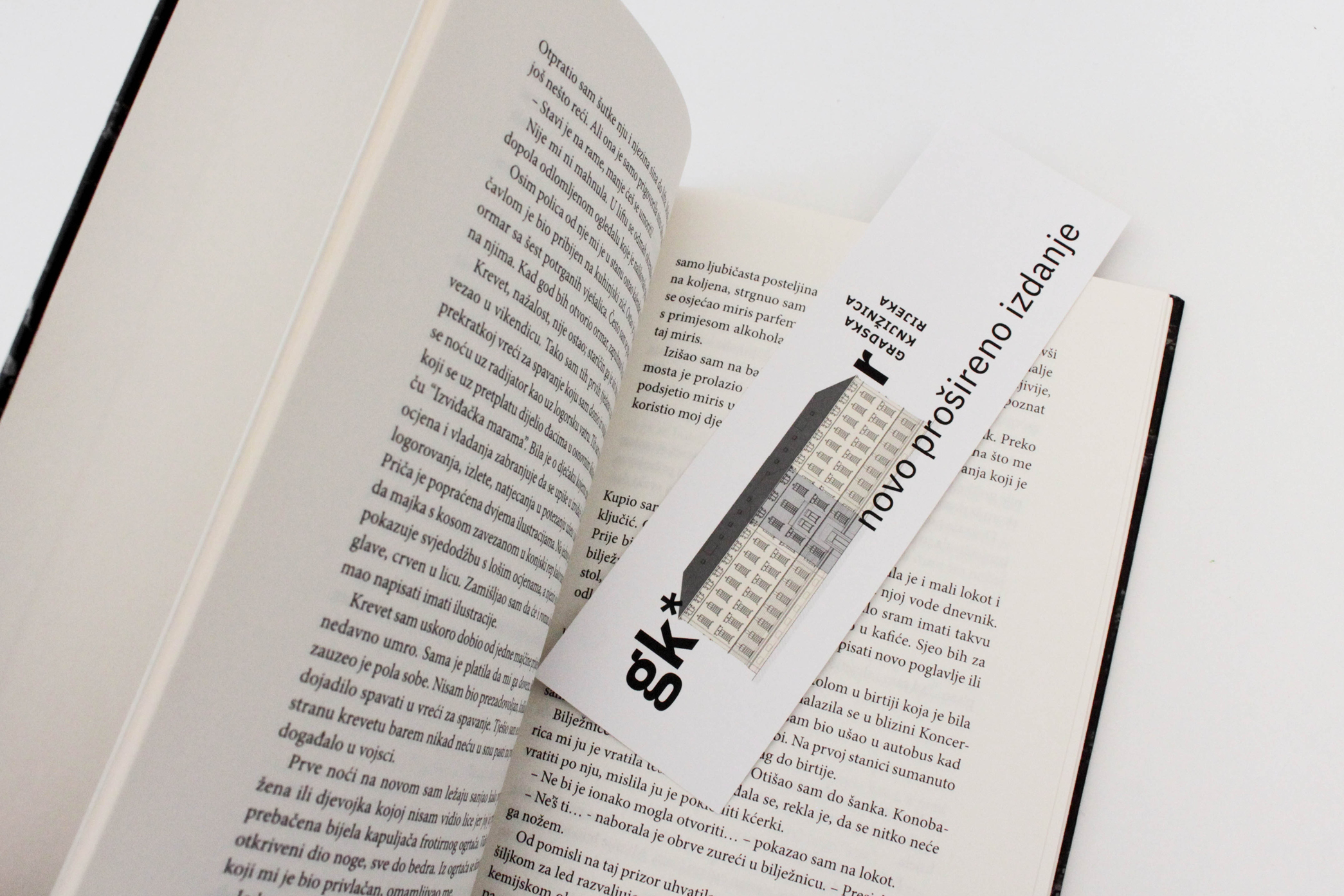
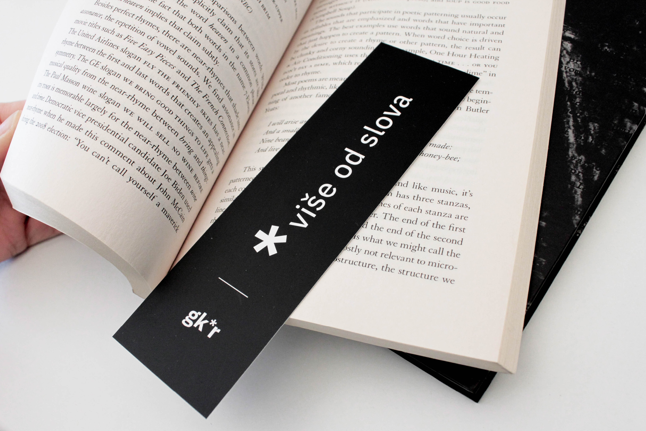
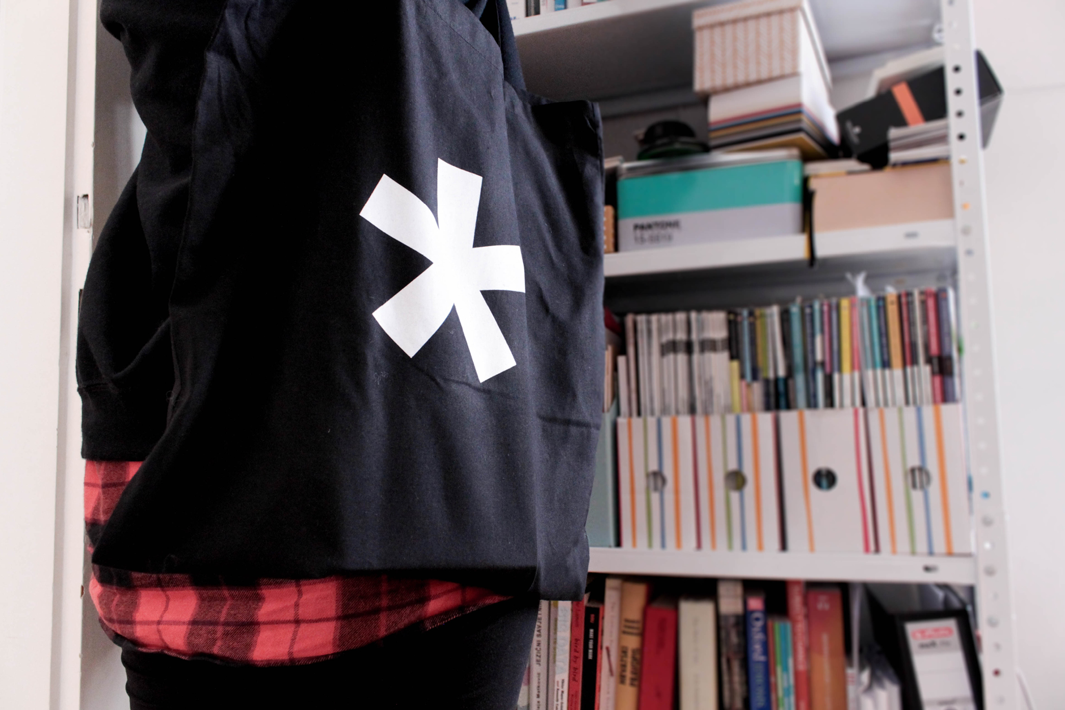
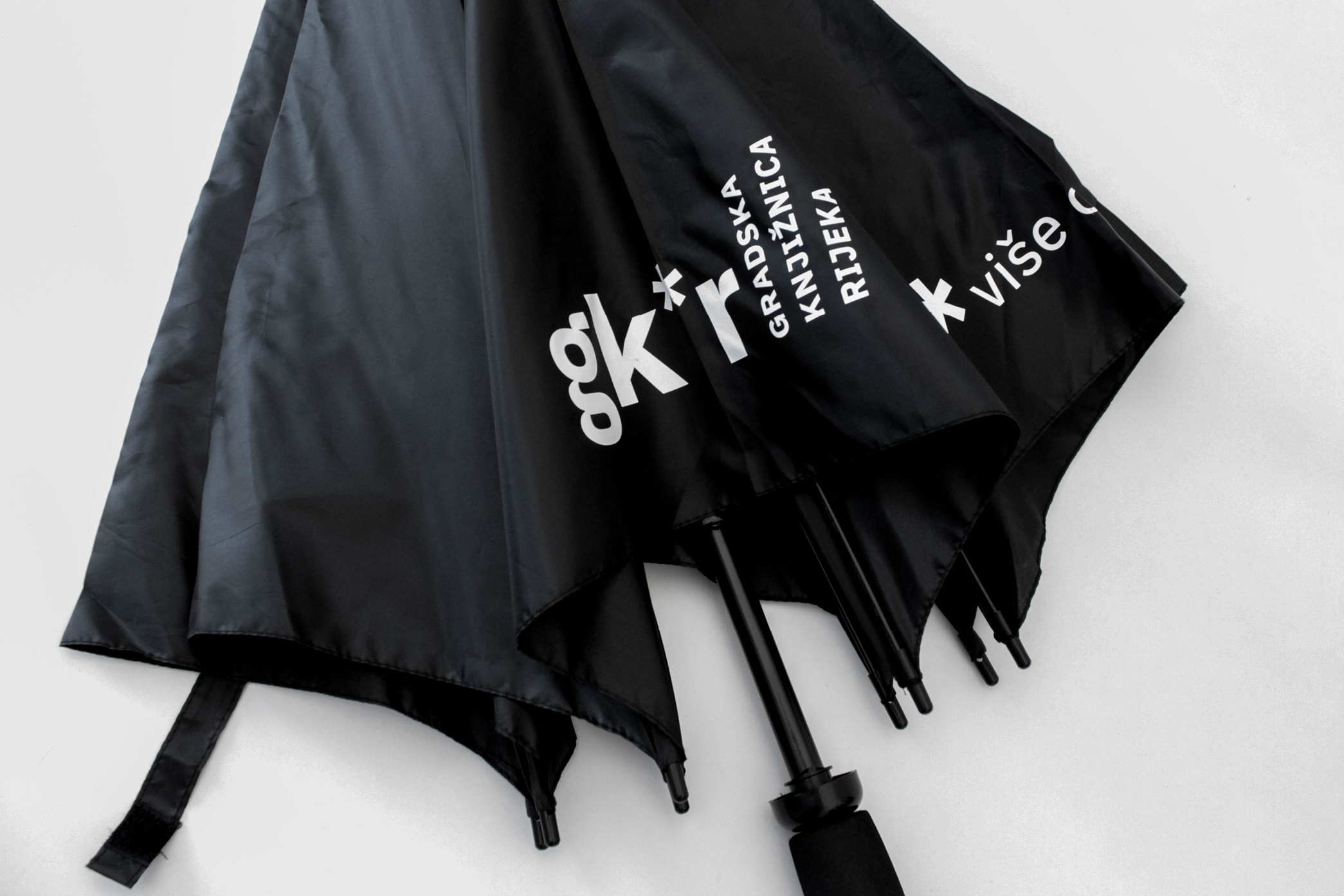
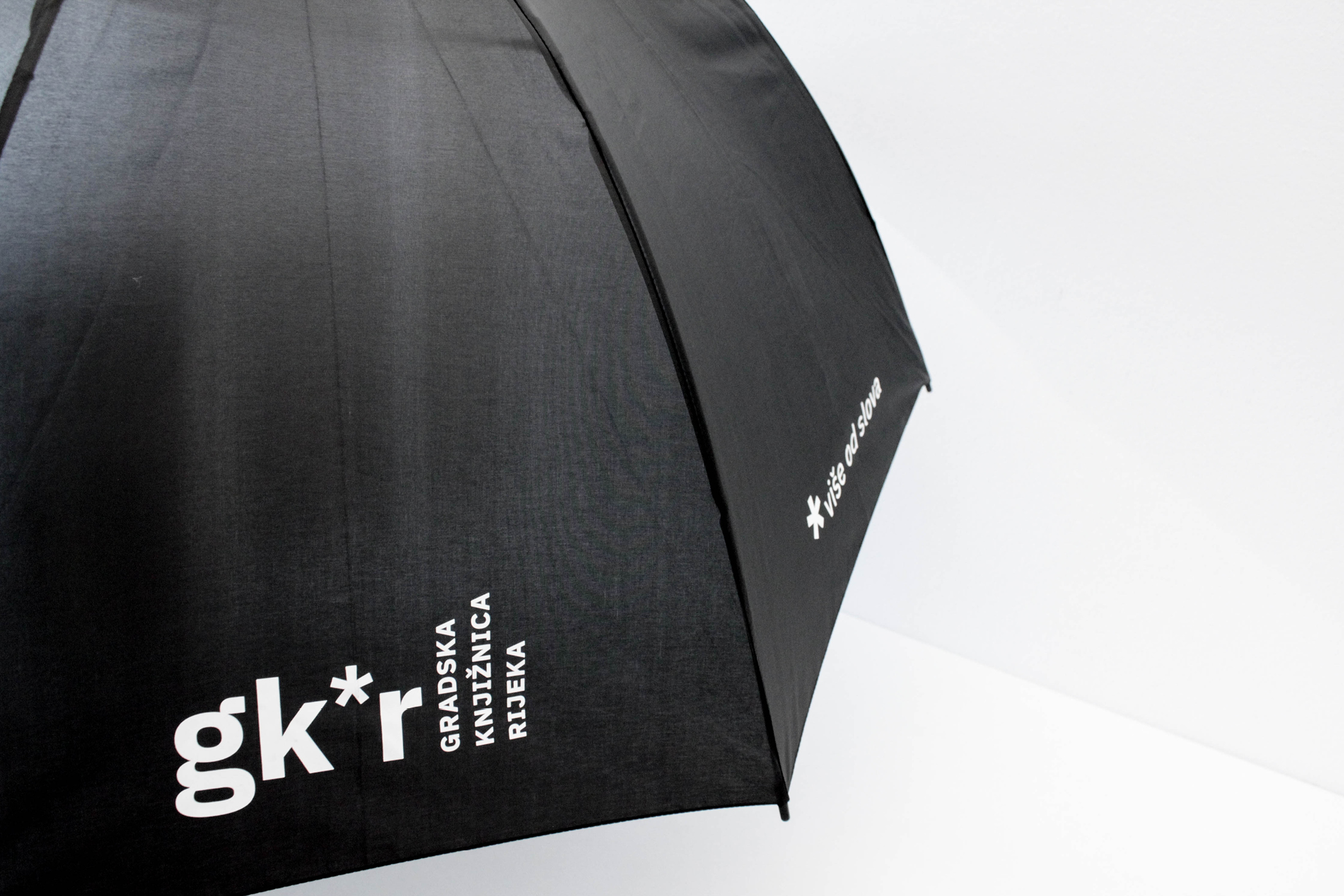
We can be pretty stubborn sometimes. But this time, it was for greater good. At least we like to think so. Rijeka City Library approached us for signage design in their new, marvellous building. Even though they kept denying they need a new visual identity, we couldn’t help ourselves and presented them with our vision. Long story short, Rijeka City Library has a new visual identity. The new building meant the new era in which the library literally creates space for new and different content - so it’s only fair that its logo does the same. With Rijeka City Library redefining the library, the footnote in its name allows the library to take on some new role or communicate any type of content - project, programme, festival, event, etc. The common asterisk but in an unexpected place. And although this library is more than just letters, its full name in the logotype is written in a familiar books-on-a-shelf manner.
Categories: visual identity, copywriting, print