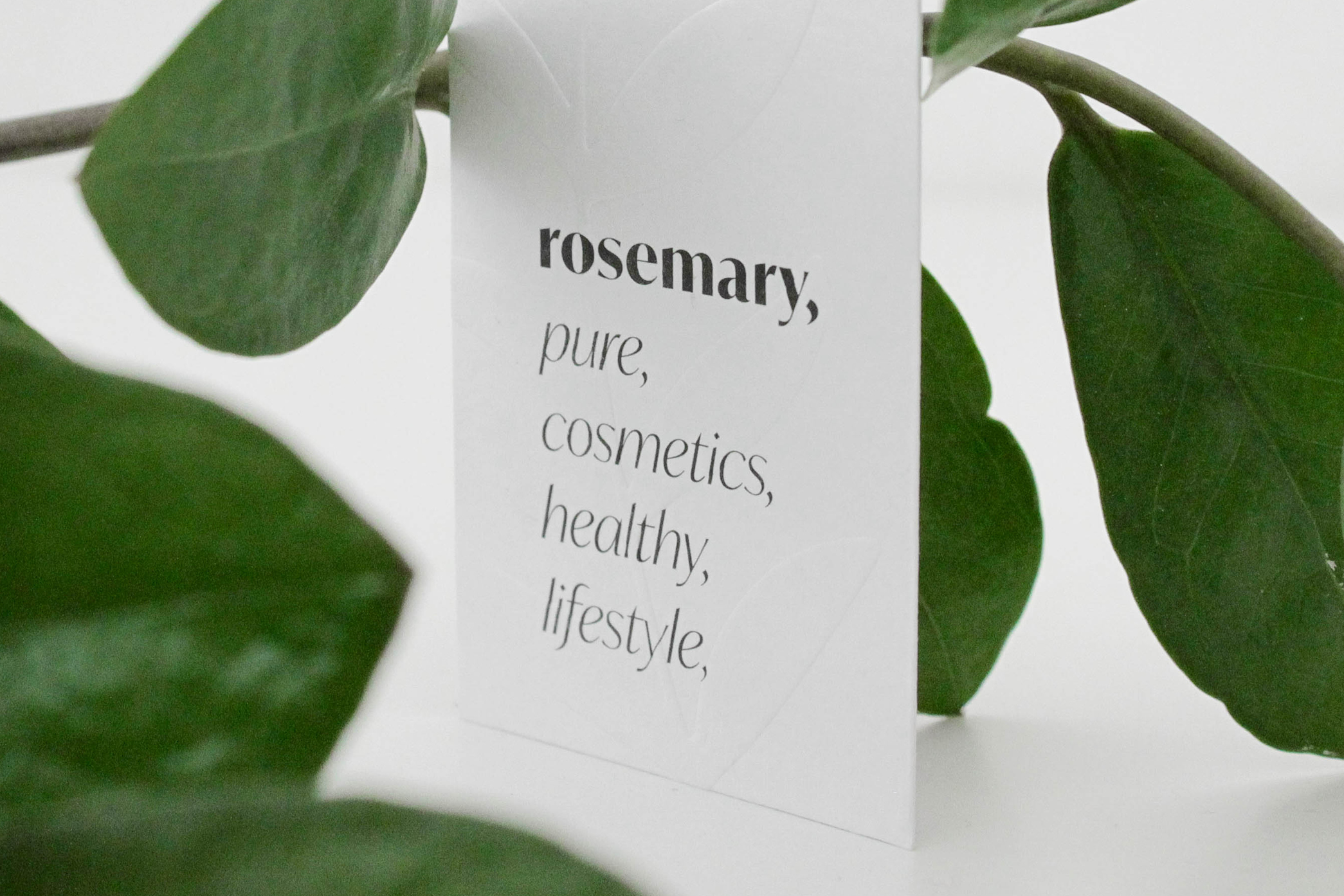
Cipmann
  • About us
  • Projects
  • Blog
  • Contact
  • hr

Sub navigation

  • ALLALL
  • identityidentity
  • namingnaming
  • signagesignage
  • copywritingcopywriting
  • publicationspublications
  • printprint
  • digitaldigital
  • packagingpackaging

  • Filter gridvisual
  • Filter gridtext
  • Project image

    Rosemary

    Rosemary was one of those wonderful cases where you get to create a new brand from scratch - name, visual identity, print materials, social networks, signage, display window, etc. We unleashed all our feminine energy and got down to work. Since the brand is all about natural, organic and/or clean cosmetics, it should look the part. Such cosmetics focuses on ingredient transparency so we used commas and lists throughout the identity. Look, visit, try, enjoy...

    Visit, the, project,
  • Project image

    3 kantuna

    We have renamed “Megi” - a studio for interior design - to “3 kantuna” (or “3 corners”) since it is run by a woman who takes care of all 3 aspects of the interior: the structure, the furniture and the details. In other words, from knocking down walls to choosing tiles and sewing throw pillows. Since 3 kantuna adapts to different types of space, we have created modular visual identity that adapts to every context. Visual elements are black lines borrowed...

    Enter the project...
  • Project image

    Pucko

    We celebrated Cipmann’s first birthday - which conveniently coincided with New Year’s holidays - by sending our clients and partners small but loud self-promotion thingie. Snappy was a self-created product which was basically a piece bubble wrap with some practical usage suggestions. It offered 3-in-1 functionality: protection from falling apart, stress relief and killing time. In a snap, we were out of bubbles, and Snappy started a tradition of Cipmann’s ...

    Snap your fingers and enter the project...
  • Project image

    Drugi par rukava

    Thrilled by Rijeka’s history and disappointed with how little people know about it, we decided to bring Rijeka’s stories closer to city’s youngsters. And we did it in collaboration with Kantoon shop. Since a good story goes a long way, we depicted Rijeka’s history through illustrated stories on T-shirts which immediately draw attention. They combine visual and textual, while design always keeps some historical element adapted to modern visual language.&nbs...

    Show me...
  • Project image

    Mediterra

    Mmmmm, honey! We all love to have our trusty homemade products dealer, and when you get the chance to create the name and visual identity for that favorite product, it’s a sweet sweet project. Name “Mediterra” combines Croatian word for honey (med) and Latin word for land (terra), and refers to the geographical origin of the honey: Mediterranean. Since all Mediterra’s products revolve around bees, we put the bee in the center and created a sort of “Vitruvi...

    Buzz through the project...

At Cipmann, we like all types of cookies (mostly chocolate), and cipmann.hr uses digital cookies. As a true hostess, we use cookies to give you the best experience on our site. By continuing to browse cipmann.hr, you agree to the use of cookies. Thank you. More information

Accept No, thanks
Close
  • Home
  • About us
  • Projects
  • Blog
  • Contact
  • Be
  • Pinterest
  • Linked in
  • Instagram
2025 Copyright © CIPMANN Ltd. All rights reserved.