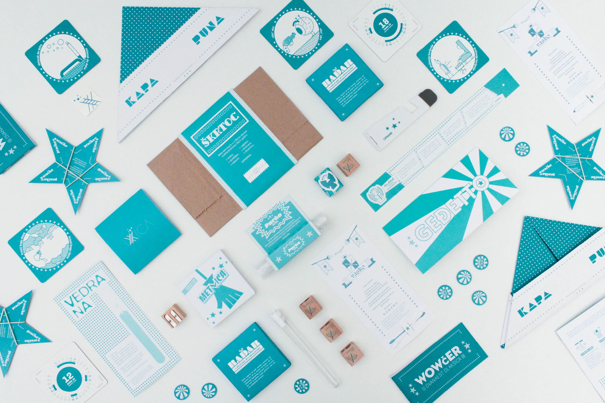
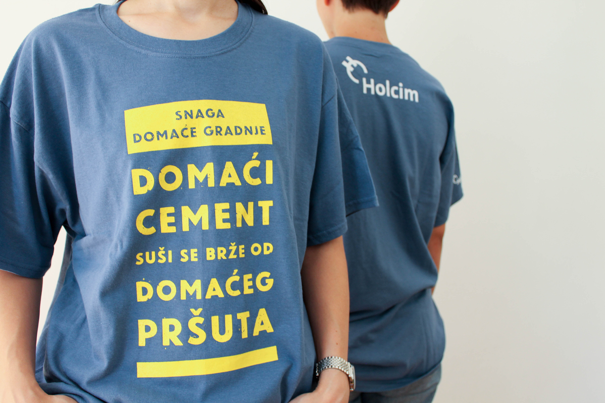
Cipmann
  • About us
  • Projects
  • Blog
  • Contact
  • hr

Sub navigation

  • ALLALL
  • identityidentity
  • namingnaming
  • signagesignage
  • copywritingcopywriting
  • publicationspublications
  • printprint
  • digitaldigital
  • packagingpackaging

  • Filter gridvisual
  • Filter gridtext
  • Project image

    PBM

    It is not often that you get the opportunity to design labels for olive oil and brandy in the same product line. So when such inquiry landed on our plate, we couldn’t curb our enthusiasm. The company PBM prepared a very refreshing set for their loyal partners - a bottle of homemade olive oil and a bottle of homemade brandy. Besides play on letters  inspired by the acronym from the company’s name (in Croatian), the labels emphasize the origin of these ...

    Uncork the project...
  • Project image

    Lungomare Art

    ometimes - not nearly enough - we do collaborations on design projects. For Lungomare Art we really enjoyed co-creating with design studio Mikser and sculptor Tomica Grubiša. In short, Lungomare Art, created as part of Rijeka 2020 – European Capital of Culture, is a cultural and tourist route along which art meets people. As a part of the project, 9 works of art have been planned in 9 locations along the Kvarner coast. The visual identity reflects these m...

    Innnnnnnnntroduce me to the project...
  • Project image

    Marinski Heartmades

    There’s nothing we love more than when we get to design stuff for something we love, admire and use outside of work. That’s exactly what happened with Marinski Heartmades ceramics. We designed its previous visual identity, but when Marinski ceramics pivoted from playful dreaminess towards elegant-slash-feminine dreaminess, it was time for a remake. Along with redesign, we did all sorts of copywriting, print materials, catalogue,… Each piece is a small, uni...

    Let’s see what you heartmade...
  • Project image

    Bibliobus

    When we put our minds together - as well as our hands - all is possible. Even pushing the big library bus! We fondly remember sitting in a pub with our creative friends from Kombinat, Molekula, Studio Artlan and Manufaktura and deciding to collaborate on a project that will be good for the community. Very soon the choice was made - we will help the Rijeka City Library with its campaign to get funding for the new mobile library. The goal was very clear and ...

    Push me towards the project...
  • Project image

    Holcim

    How to say “Buy local” in a fresher, more interesting way? That was the question that people from Holcim asked when they approached us for the T-shirt design that would promote buying local cement. After considerable brain activity, a series of T-shirt designs was created with well known Croatian phenomena. Printed messages are based on the characteristics of cement and linked verbally with some local sayings in quite an unexpected way. ...

    Unpack the project...
  • Project image

    Crikvenica

    Crikvenica’s history and culture appear to be some of the best kept secrets in Kvarner, so we wanted to tell its story to the present and future visitors of this small city. Although tourists visit Crikvenica mostly to enjoy the sun, sea and beaches, the town was once a fisherman’s village. It also has a very interesting gastronomic history and nowhere else can you spend the night at an ex-monastery. We illustrated the story of Crikvenica, and those who li...

    Carry me to the project...
  • Project image

    Elcon Geraetebau

    Elcon Geraetebau is the leading CNC manufacturers of high-precision parts in SE Europe and that is precisely why we created the slogan “Measure of precision”. Elcon Geraetebau is Cipmann’s greatest project in terms of diversity of materials created for them. Our primary task was to redesign their identity in the direction of modern and strong company on the global market. We achieved visibility with a very recognizable shade of green, and the logotype is c...

    Measure the project up...
  • Project image

    Misho & Robin

    Moms being moms, we love to create content for our kids. So when the guys from animation studio Recircle approached us and asked if we would work on the scripts for animated kids TV series Misho & Robin, there was no doubt in our minds. It was a chance to create content for all kids, not only ours. In 30-ish 5-minute episodes we took Misho the cat, Robin the robin and their quirky gang all over the place - over the hills, forests, sea and creeks where ...

    Turn on the project...
  • Project image

    Peek+Poke

    Designing for the museum of childhood sounds like a dream project. And it was. While we were admiring toys and games of our past, we felt like riding a time machine. So it was only natural to choose the time machine as the concept of the Peek+Poke’s visual identity. That’s why the name of the museum became a colorful time traveling machine and its winding key a recognizable symbol that can be used on its own. Museum’s physical space is divided into section...

    Take a ride through the project...
  • Project image

    3 kantuna

    We have renamed “Megi” - a studio for interior design - to “3 kantuna” (or “3 corners”) since it is run by a woman who takes care of all 3 aspects of the interior: the structure, the furniture and the details. In other words, from knocking down walls to choosing tiles and sewing throw pillows. Since 3 kantuna adapts to different types of space, we have created modular visual identity that adapts to every context. Visual elements are black lines borrowed...

    Enter the project...

At Cipmann, we like all types of cookies (mostly chocolate), and cipmann.hr uses digital cookies. As a true hostess, we use cookies to give you the best experience on our site. By continuing to browse cipmann.hr, you agree to the use of cookies. Thank you. More information

Accept No, thanks
Close
  • Home
  • About us
  • Projects
  • Blog
  • Contact
  • Be
  • Pinterest
  • Linked in
2023 Copyright © CIPMANN Ltd. All rights reserved.