Cipmann
  • About us
  • Projects
  • Blog
  • Contact
  • hr

Sub navigation

  • ALLALL
  • identityidentity
  • namingnaming
  • signagesignage
  • copywritingcopywriting
  • publicationspublications
  • printprint
  • digitaldigital
  • packagingpackaging

  • Filter gridvisual
  • Filter gridtext
  • Project image

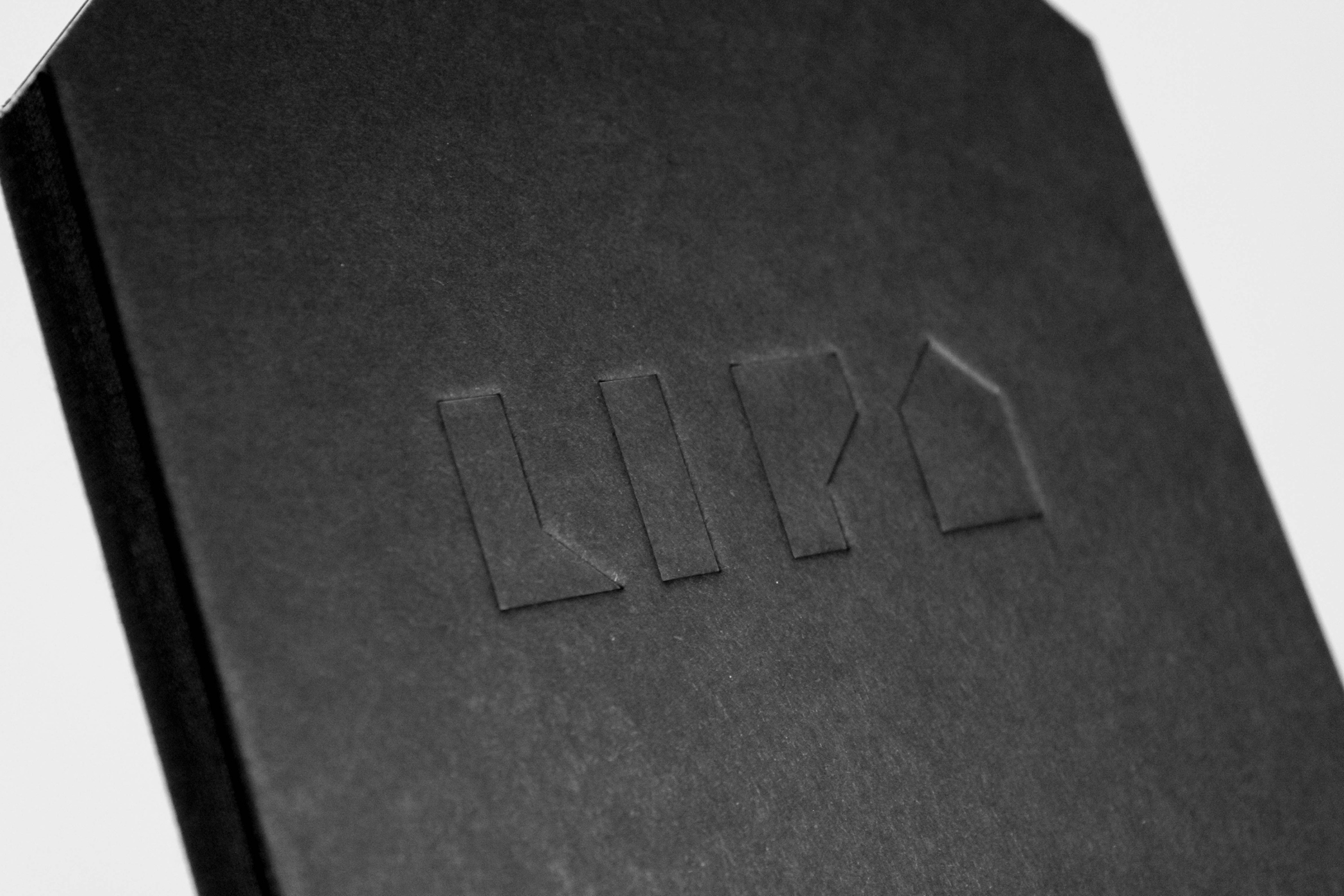
    LIPA REMEMBERS - ANNIVERSARY PUBLICATION

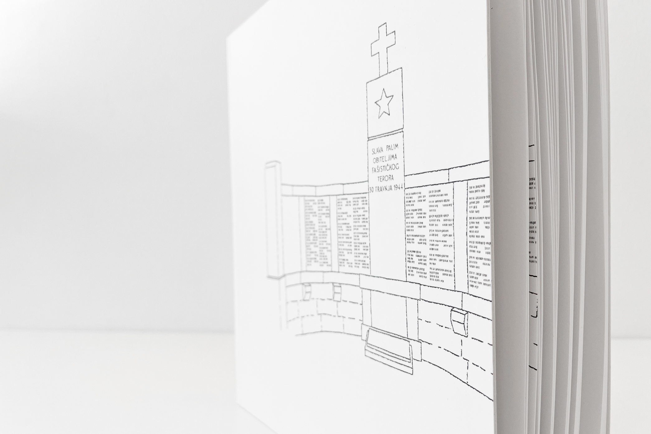
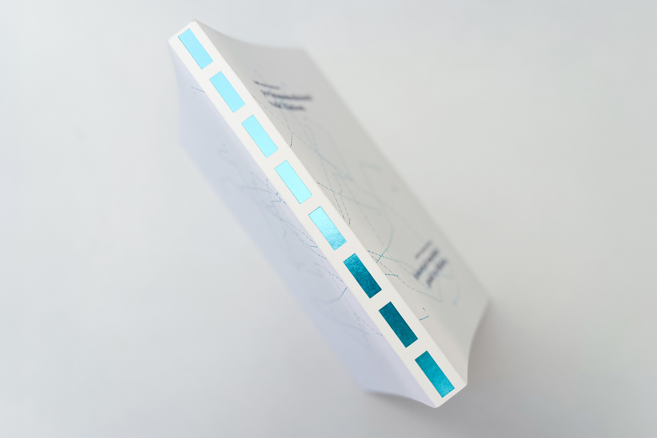
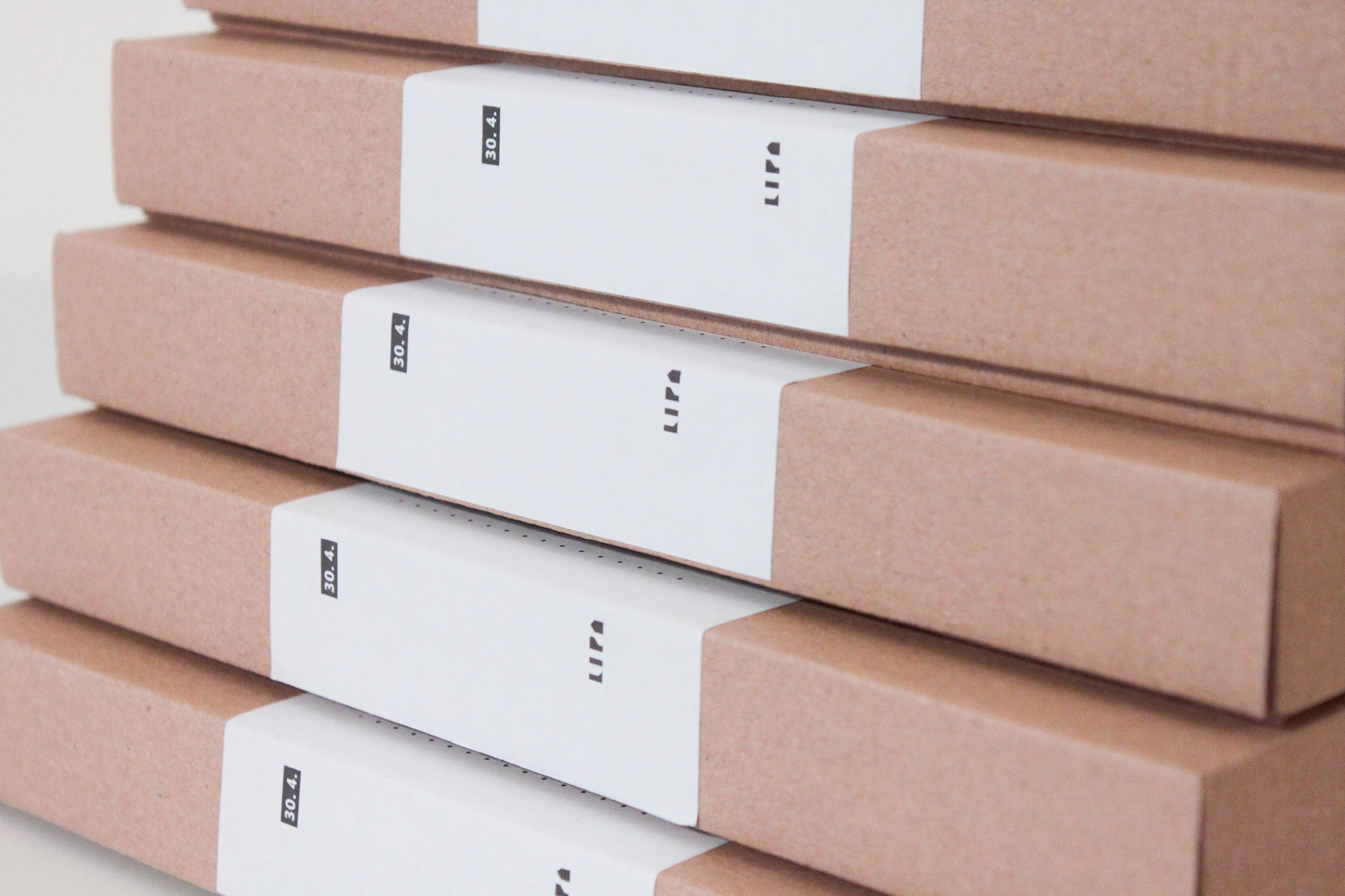
    One of our projects for Memorial Centre Lipa Remembers was a publication for 75th anniversary of the massacre in Lipa. For 75 years Lipa has been remembering the slaughter, remembering the destruction, remembering the loss. And even this collective memory has its own history. The book depicts what it is that Lipa remembers and in what way. The publication is stripped of fancy covers with visible stitches and the colours are brought down to a bare minimum -...

    Tearing up in 3, 2, 1…
  • Project image

    Korak po korak

    Open Academy Step by Step is on a mission to introduce and support practices that ensure the wellbeing of all children and lead to a child-friendly society. It’s not an easy feat but taking one step at a time, things can change. So we too started with the basics - circle, triangle and square - and added some color. With these essentials, step by step, we created visual identity, website, and numerous material and publications for Step by step. Since they p...

    Propel the project...
  • Project image

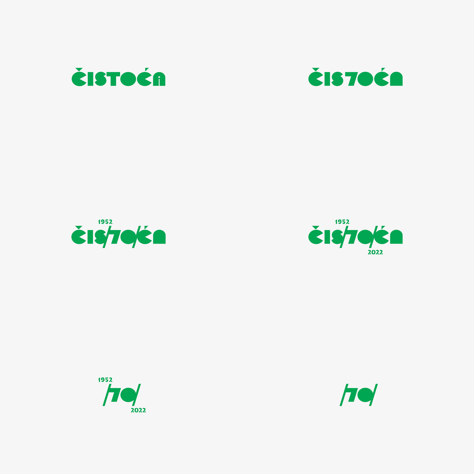
    ČISTOĆA - A COMPANY MONOGRAPH

    We just love anniversaries. When in that celebratory mode, clients tend to be open to something a bit more special. For utility company Čistoća’s 70th anniversary we created an anniversary logo and a company monograph. Due to the volume and diversity of content for the book, we developed a set of graphic elements which we used to create infographics, to break large amounts of text, to emphasise specific content, and - wherever we could - we presented the n...

    Leaf through the project...
  • Project image

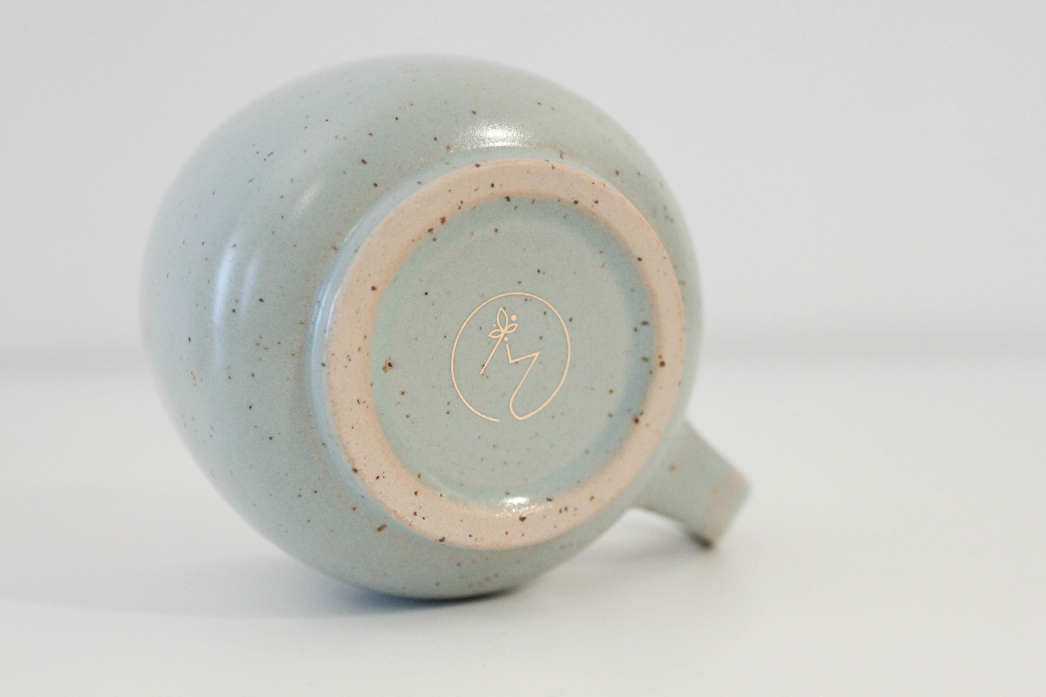
    Marinski Heartmades

    There’s nothing we love more than when we get to design stuff for something we love, admire and use outside of work. That’s exactly what happened with Marinski Heartmades ceramics. We designed its previous visual identity, but when Marinski ceramics pivoted from playful dreaminess towards elegant-slash-feminine dreaminess, it was time for a remake. Along with redesign, we did all sorts of copywriting, print materials, catalogue,… Each piece is a small, uni...

    Let’s see what you heartmade...
  • Project image

    Lipa Remembers guidebook

    This guidebook was the first project we did for Memorial centre in Lipa, still unaware what we were getting ourselves into - and we got ourselves into the story so emotional and full of life among so much death. It was astonishing to see how the war tragedy made people of this small town so connected (although, Lipa is anything but small). And the town and its story got under our skin.  This museum guidebook could be called a picture book for adult...

    Goosebumps, please…
  • Project image

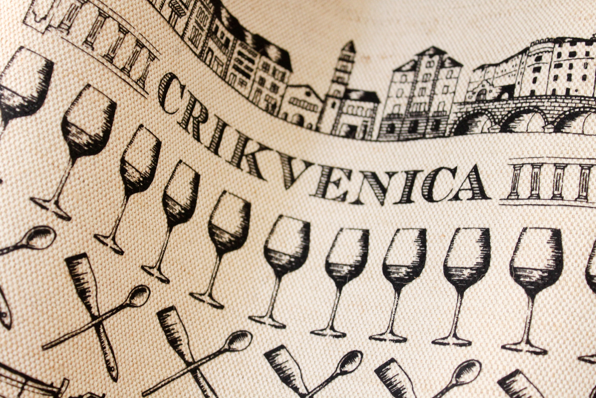
    Crikvenica

    Crikvenica’s history and culture appear to be some of the best kept secrets in Kvarner, so we wanted to tell its story to the present and future visitors of this small city. Although tourists visit Crikvenica mostly to enjoy the sun, sea and beaches, the town was once a fisherman’s village. It also has a very interesting gastronomic history and nowhere else can you spend the night at an ex-monastery. We illustrated the story of Crikvenica, and those who li...

    Carry me to the project...
  • Project image

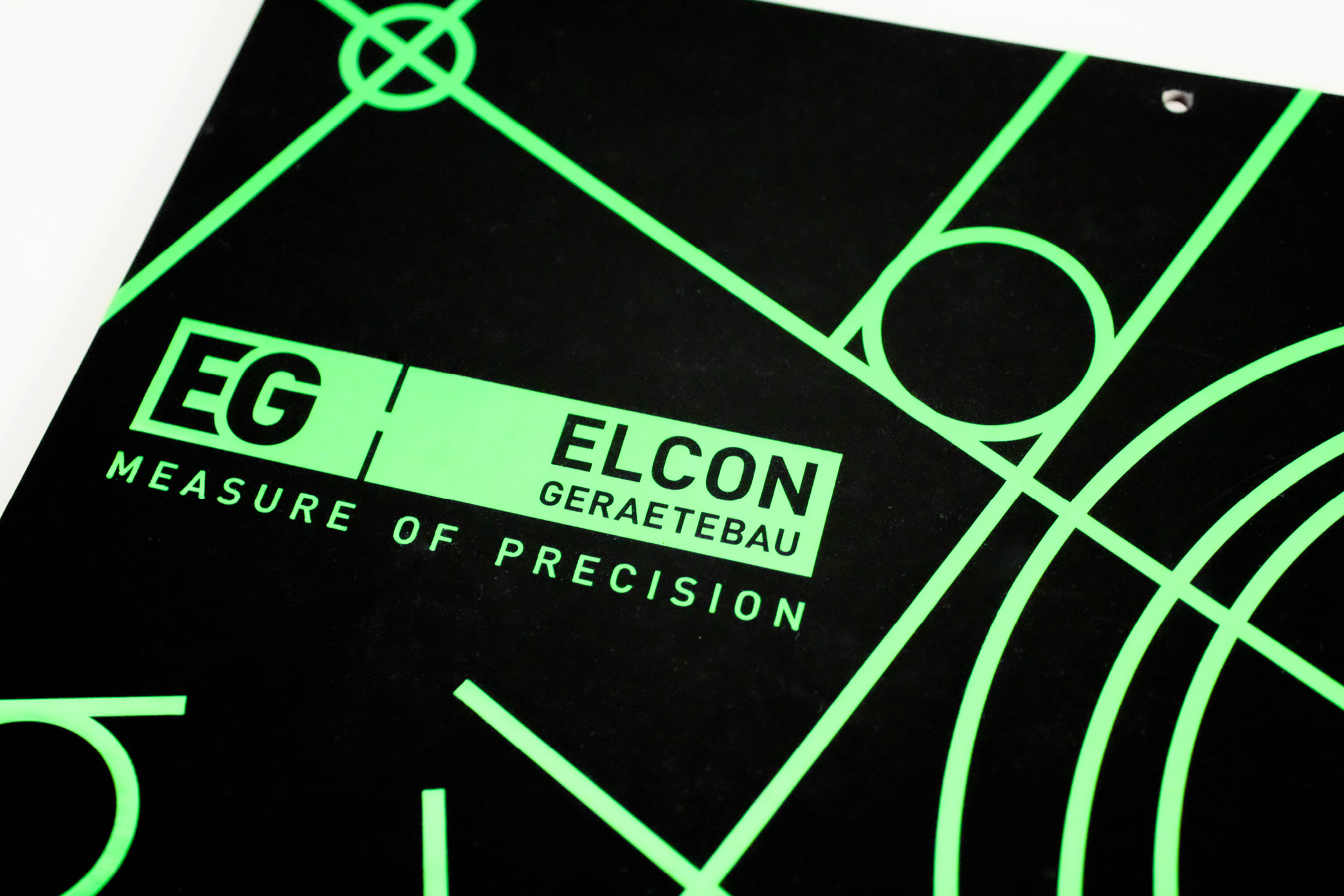
    Elcon Geraetebau

    Elcon Geraetebau is the leading CNC manufacturers of high-precision parts in SE Europe and that is precisely why we created the slogan “Measure of precision”. Elcon Geraetebau is Cipmann’s greatest project in terms of diversity of materials created for them. Our primary task was to redesign their identity in the direction of modern and strong company on the global market. We achieved visibility with a very recognizable shade of green, and the logotype is c...

    Measure the project up...
  • Project image

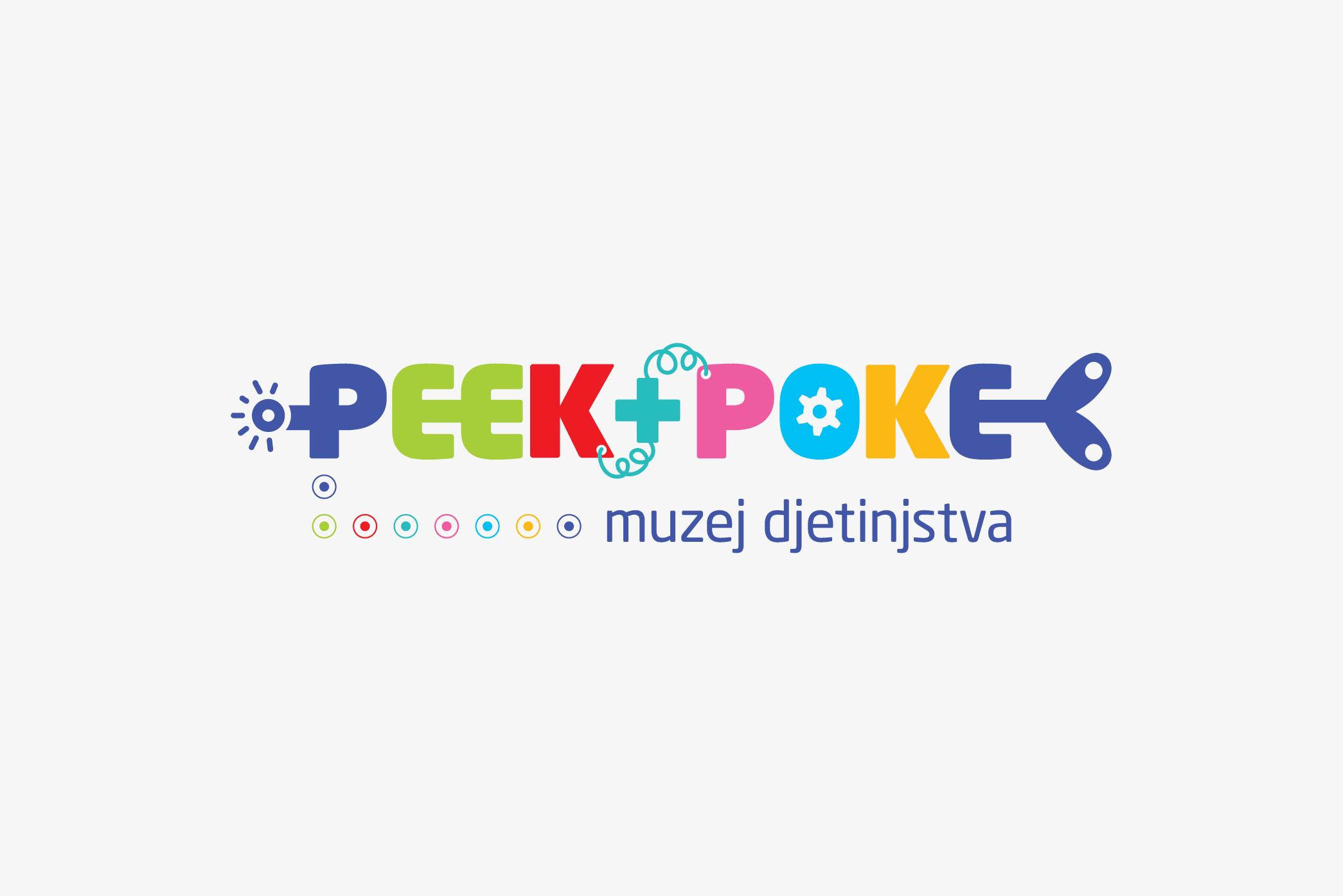
    Peek+Poke

    Designing for the museum of childhood sounds like a dream project. And it was. While we were admiring toys and games of our past, we felt like riding a time machine. So it was only natural to choose the time machine as the concept of the Peek+Poke’s visual identity. That’s why the name of the museum became a colorful time traveling machine and its winding key a recognizable symbol that can be used on its own. Museum’s physical space is divided into section...

    Take a ride through the project...
  • Project image

    Euroway

    A small language school from the small town of Kastav approached us with a great wish for visual identity redesign. Line by line, color by color, redesign soon became a completely new design which reflected warmth and Euroway’s unique family atmosphere much better than the previous design. Since the school spices up the classes with various customs and interesting rituals such as drinking afternoon tea or Easter egg hunts, the identity was based on the mot...

    Come in for a cup of Euroway...

At Cipmann, we like all types of cookies (mostly chocolate), and cipmann.hr uses digital cookies. As a true hostess, we use cookies to give you the best experience on our site. By continuing to browse cipmann.hr, you agree to the use of cookies. Thank you. More information

Accept No, thanks
Close
  • Home
  • About us
  • Projects
  • Blog
  • Contact
  • Be
  • Pinterest
  • Linked in
  • Instagram
2025 Copyright © CIPMANN Ltd. All rights reserved.