Cipmann
  • About us
  • Projects
  • Blog
  • Contact
  • hr

Sub navigation

  • ALLALL
  • identityidentity
  • namingnaming
  • signagesignage
  • copywritingcopywriting
  • publicationspublications
  • printprint
  • digitaldigital
  • packagingpackaging

  • Filter gridvisual
  • Filter gridtext
  • Project image

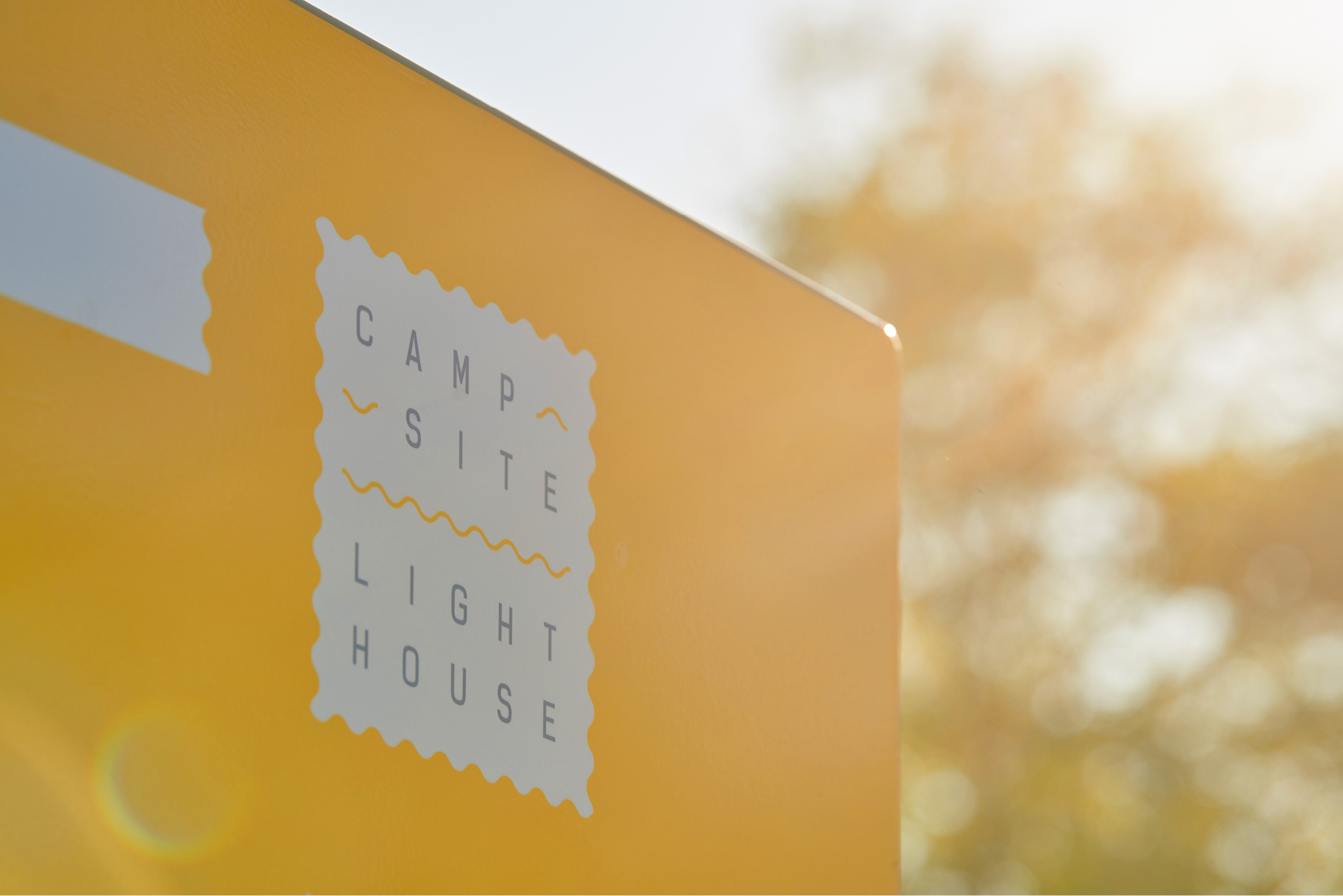
    Campsite Lighthouse

    We still remember the times when if you wanted to buy something to remember your trip/vacation by - it would be a postcard. It was before selfies, and even before fridge magnets. With that dear memory of postcards and stamps lingering in our minds, we created a visual identity for Campsite Lighthouse in Savudrija - a place made for wonderful memories and unforgettable moments of freedom and unwinding. Since this sea camp has a lighthouse as its first neigh...

    Greet the project…
  • Project image

    Korak po korak

    Open Academy Step by Step is on a mission to introduce and support practices that ensure the wellbeing of all children and lead to a child-friendly society. It’s not an easy feat but taking one step at a time, things can change. So we too started with the basics - circle, triangle and square - and added some color. With these essentials, step by step, we created visual identity, website, and numerous material and publications for Step by step. Since they p...

    Propel the project...
  • Project image

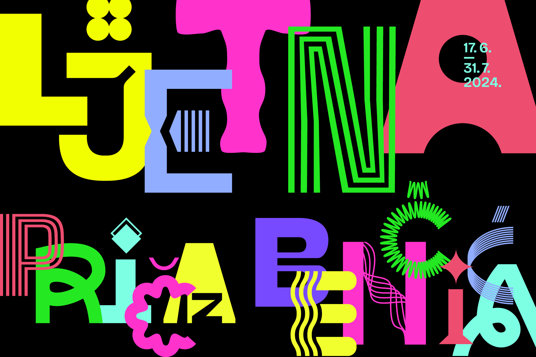
    LJPB

    When the brief says: “it’s not about the age, it’s about silliness” and “totally off” - then we know we can make some bold design decisions. So we embraced black as the summer color, we got really carried away while constructing letters and we encouraged using very challenging acronym LJPB. And LJPB stands for “Ljetna priča iz Benčića” - a summer festival organized by Rijeka City Library, American Corner and local museums and theatre. And what kind of fest...

    Let’s see the project…
  • Project image

    Rijeka City Days 2024

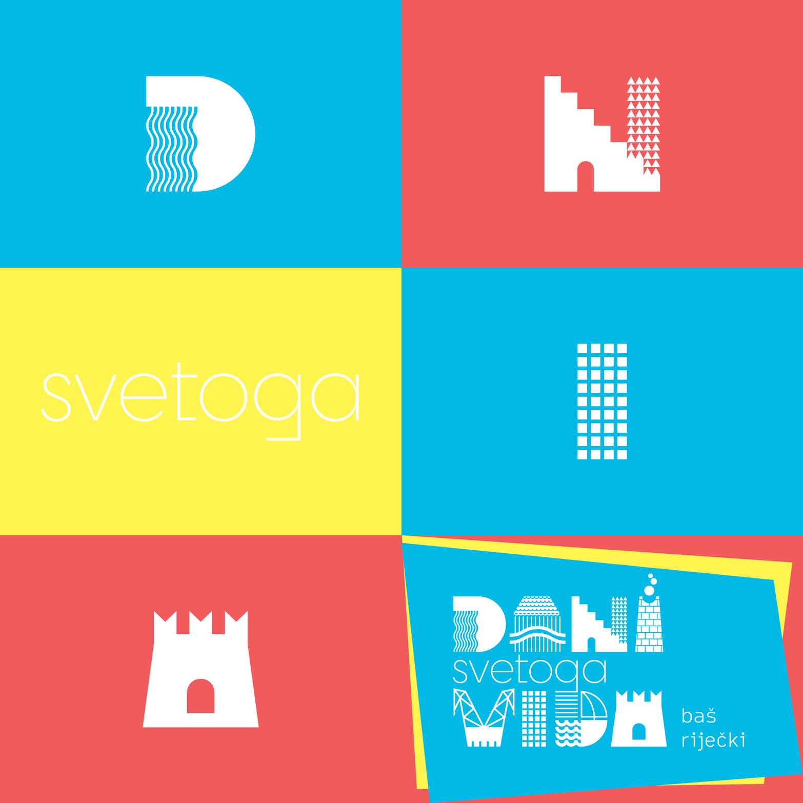
    Summer! Good company! A buzz of excitement! Sport! Music! Shows! Good vibrations! These are all perfect descriptions of Rijeka City Days (a.k.a. Dani svetoga Vida). The numerous events take place all over the city and it truly is an urban festival. With that in mind, we created letters which are constructed out of Rijeka’s urban elements - water, architecture, industrial heritage, steps, cranes, skyscrapers, sailboats, a castle, etc. In the background - or...

    Take me to the project...
  • Project image

    Rosemary

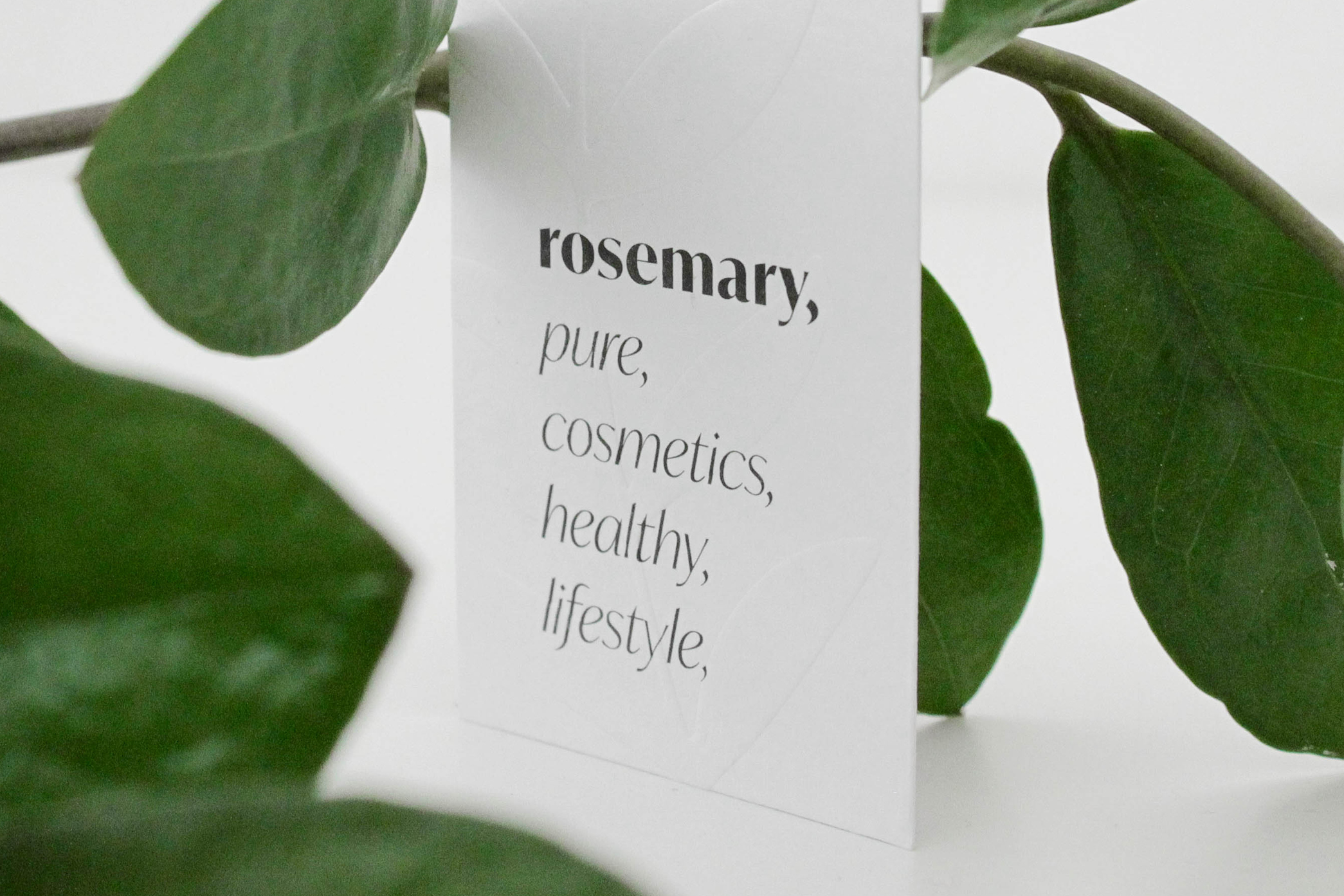
    Rosemary was one of those wonderful cases where you get to create a new brand from scratch - name, visual identity, print materials, social networks, signage, display window, etc. We unleashed all our feminine energy and got down to work. Since the brand is all about natural, organic and/or clean cosmetics, it should look the part. Such cosmetics focuses on ingredient transparency so we used commas and lists throughout the identity. Look, visit, try, enjoy...

    Visit, the, project,
  • Project image

    Riperaj

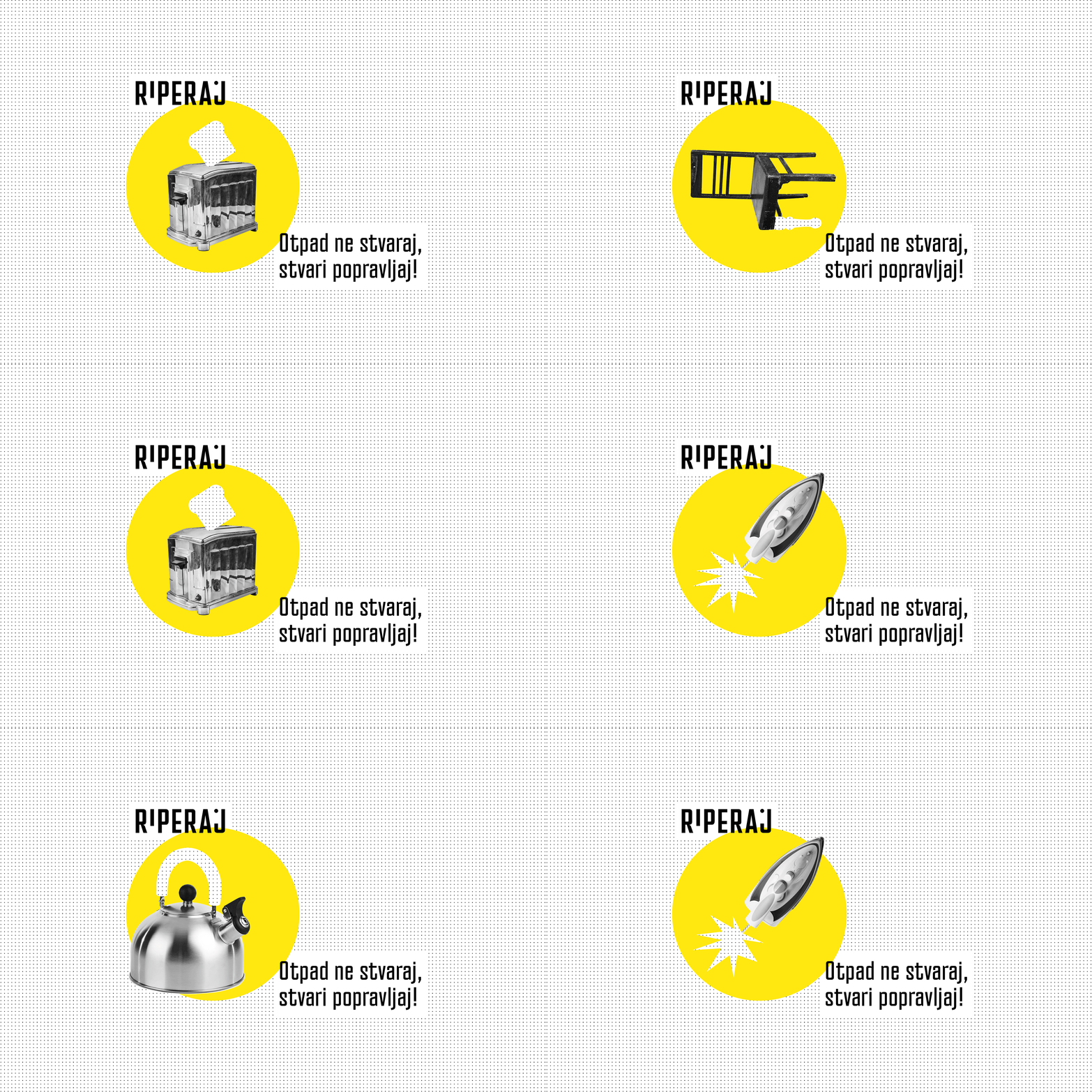
    KD Čistoća launched Riperaj, and that launched another lovely collaboration with Lea and Mirna from Kombinat. This epic collab took place in ancient 2019, but we still think of it often.  In short, Riperaj is the first repair center in Croatia and its aim is to reduce waste by repairing old, unused and broken items. At Riperaj you can find various tools, spare parts, a helping hand and an expert advice, but the idea is to do the work yourself. So i...

    Assemble the project…
  • Project image

    Cipmann self-promotion

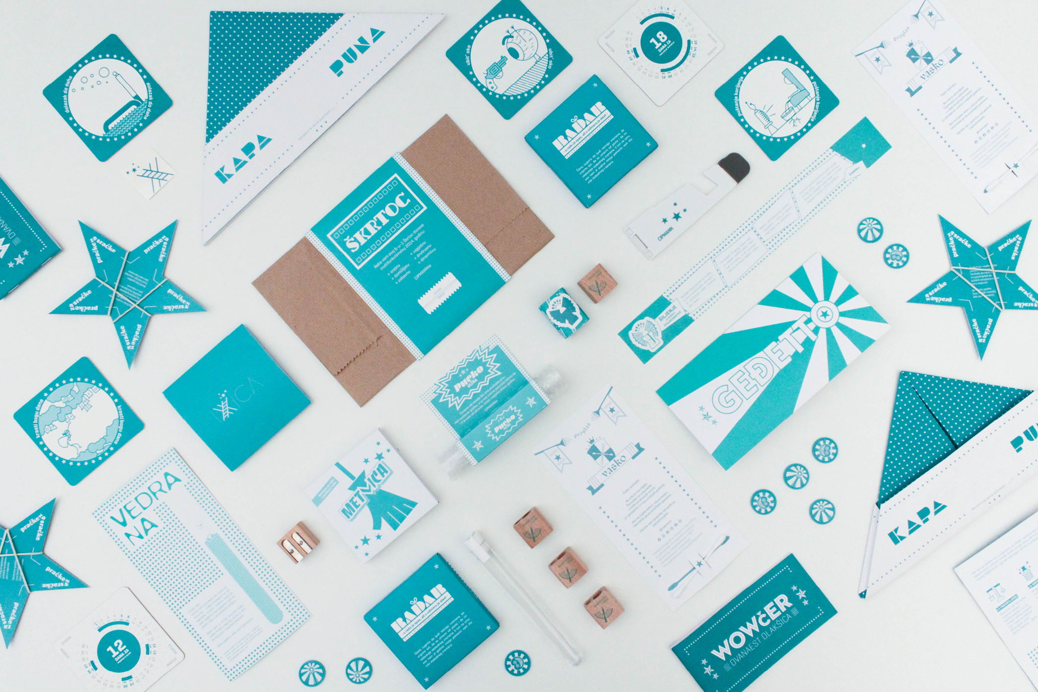
    For Cipmann’s first birthday (which coincides with New Year) we unintentionally started a trend of sending out silly little gifts. In the beginning there was Pucko (Snappy) - a multifunctional bubble wrap, while some other incarnations include coasters that suggest which days to take off (to make the most of the year) and a paper cap when you’re up to your ears in troubles. All in all, once a year our dear partners receive our turquoise-packaged silliness ...

    Greet the project…
  • Project image

    Ekoplus

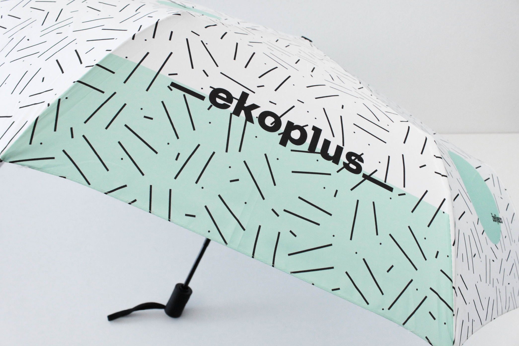
    To do a research about trash doesn’t sound so appealing at first, but it was fun. Getting to know Ekoplus and their waste management centre, we realized it is a modern and neatly structured industry. They demystified what they do and showed us various processes that take place in their facilities. These processes transform the waste into different things - fuel, water, metal, etc. - but most of all - energy. Black linear pattern represents the waste tha...

    Demystify the project...
  • Project image

    RIJEKA CITY LIBRARY - ID

    We can be pretty stubborn sometimes. But this time, it was for greater good. At least we like to think so. Rijeka City Library approached us for signage design in their new, marvellous building. Even though they kept denying they need a new visual identity, we couldn’t help ourselves and presented them with our vision. Long story short, Rijeka City Library has a new visual identity. The new building meant the new era in which the library literally creates ...

    Tak*e me to the project...
  • Project image

    Lungomare Art

    Sometimes - not nearly enough - we do collaborations on design projects. For Lungomare Art we really enjoyed co-creating with design studio Mikser and sculptor Tomica Grubiša. In short, Lungomare Art, created as part of Rijeka 2020 – European Capital of Culture, is a cultural and tourist route along which art meets people. As a part of the project, 9 works of art have been planned in 9 locations along the Kvarner coast. The visual identity reflects these ...

    Innnnnnnnntroduce me to the project...

At Cipmann, we like all types of cookies (mostly chocolate), and cipmann.hr uses digital cookies. As a true hostess, we use cookies to give you the best experience on our site. By continuing to browse cipmann.hr, you agree to the use of cookies. Thank you. More information

Accept No, thanks
Close
  • Home
  • About us
  • Projects
  • Blog
  • Contact
  • Be
  • Pinterest
  • Linked in
  • Instagram
2025 Copyright © CIPMANN Ltd. All rights reserved.